Categories
Misc. Clubs . . .

Premier League name and numbers black/white

Manchester City name and numbers | EPL kit black/white

The second most popular color variation of the Premier League names and numbers is the black/white variant.

The by most widely used is white/black while navy, red, and gold are used rather seldomly.


Man City girl displaying the EPL names and numbers


and lets look at the plain letters and see how they look like when applied to the garment.


Man City EPL names and numbers

Categories
Misc. Clubs . . .

Premier League Champs badges

Premier League Champs badges | EPL gold badges

Premier League gold badges are worn by the reigning champs of the previous season.

Manchester City won the English Premier League for the season 11/12 thus during the season 12/13 they have been wearing the gold badges.

For the season 13/14 Manchester United as the reigning champs will be equipped with the golden badges.

Contrary to other leagues the Premier League has decided that there should be a badge featuring the league on each sleeve so in fact there is a set with two badges.


Man City EPL champs badges 11-12


The Manchester City gold badge features the EPL logo prominantly as well the sponsor Barclays.


Man City champs badge right arm sleeve


Categories
FC Bayern Munich

FC Bayern home jersey 11-13

FC Bayern Munich 2011/2013 Home Jersey Review

(With player #31, Schweinsteiger customization.)


Bayern Munich, as it stands, have an impressive 12 point lead at the top of the Bundesliga table in Germany. In 20 matches, they have obtained 51 points from 60 possible, and that’s just because of a single loss and three draws. If that was not impressive on its own, their goal difference is an astonishing +44, that’s 51 goals scored, and just 7 conceded! Why does this all matter? Because Bayern Munich are veteran German legends, and their feisty lunge to retrieve what they believe is rightfully theirs, the Bundesliga title, needs to be supported by the look of a champion on the field. Bayern Munich’s 11/13 Home Jersey does just that, bringing a simplistic yet intimidating look that keeps the roar of Die Roten ringing throughout the competitive premier football league of Germany.


With an astounding league run, a top-notch squad, and the incredible incoming manager of Josep Guardiola just around the corner, the only thing Munich fans need to know is to keep their feet on the ground so that they don’t take off in heavenly bliss. It’s going to be hard to deny the title to FC Bayern Munich this year.


As I review their home jersey, as seen in the 11/12 season and now in the current 12/13 season, I’ll be looking at some deeper perspectives than ever before, appreciating and detailing the custom value of a jersey such as this, printed with “31 SCHWEINSTEIGER”, the impeccable German midfield maestro as seen on the field for Munich and the German national team.


FC Bayern home jerseyFC Bayern name and number kit


The Look


I’ve always been a part-fan of Munich to put it one way. I favor other clubs but I can and have appreciated the raw strength and machine-like consistency and performances of the wondrous Germany club. But in all honesty, I’ve never been a big fan of their kits. I find that their most recent kits have had way too much white and have given too much of a carnival-like feel, but this is just a matter of taste and does not likely convey the majority opinion. With this new home-kit, my taste wins.


FC Bayern fabric patternFC Bayern 3 stripes sleevesFC Bayern collar


The strong red color that is now the basis of the entire jersey is powerful. Gone are the large white stripes, be they vertical or horizontal. Adidas and Munich have brought a new look to the table that is simple and clean, yet manages to capture the ferocity of Munich with its small touches and elegancy. The cool red encompasses the entire shirt, but it is greatly enhanced by the decision to use gold as the trim and secondary color. The signature Adidas stripes down the shoulders: Gold. The thin ring at the end of the sleeves and the lines about the neck area and the lower-sides of the jersey: Gold. The personalization name, number, and club title on the back: Gold. I feel that the selection to use gold, and in particular, a shade that perfectly matches the four stars above Munich’s classy emblem, makes this a really nice jersey that looks very nice and regal. It’s sporty, both in its nature and use, but the design has its chin up in the cleanliness and simplicity. The glossy zigzag design on the front of the jersey, easily seen in certain light, adds a nice detail to the shirt that is subtle and suppressed.


The Deutsche Telekom AG sponsorship goes well with the new jersey, their signature “T” logo is not intrusive at all and it makes for a well-cut presence on the front of the shirt.


FC Bayern sponsor logoadidas logoFC Bayern club logo


On the back of the inside-neck area, the motto has been included: “Mia san Mia”, Bavarian text for “We are who we are”, a brief and proud expression that holds the clubs players, fans, and origins in high regard. It complements the comment opposite of it, on the back of the shirt at the neck. In bold text it reads, “REKORDMEISTER”! Shouting out the undeniable fact that Bayern Munich are a highly titled, record breaking team, the “Record Holding Champions”. It is a shirt with an exceptional touch of high-standing, but if not at the top, where else could you place the 22 time national title champions?


FC Bayern collar Mia San MiaFC Bayern sleeve Bundesliga badgeFC Bayern collar


My finishing comments on the look are that it just complements itself so well. The red color accented with gold is just such a nice look, and the choice to leave out obtrusive white segments and an over athletic design have paved the way for one of Munich’s nicest shirts in years. I’m a big fan of the look and I’m happy with their changes and the direction.


The Fit


Munich’s new shirt is a real piece of production excellence. I have many jerseys and I’ve been able to appreciate a broad diversity of fits, feels, and fabrics. I rate FC Bayern Munich’s 11/13 Home jersey as one of the best quality shirts.


FC Bayern adidas hologramFC Bayern clima cool polyesterFC Bayern size


The overall product, as manufactured by Adidas, is a work of art. The Adidas stripes are silky smooth and the club’s crest has a covering fabric on the inside of the shirt to avoid discomfort to the wearer from the embroidery. The quality is top-of-the-line.


The jersey fits very well. I always get my jerseys in USA Size “L” (Large), though I actually may fit medium better. I prefer a slightly looser feel of a jersey and it works well in all seasons for me. As is the case with pretty much all Adidas jerseys, I have no complaints with the fit and size.


I always approach the fabric of jerseys with a “is it thin or thick?” test and I consider this jersey to be a comfortable, mid-level material. Some jerseys can be great but the thickness creates too much heat or is abrasive and uncomfortable for movement, but Bayern Munich’s 11/13 home jersey does not suffer these issues. I’ve enjoyed this jersey in many conditions and never found it to be a hindrance to my task at hand.


The Customization


Once again, the generosity of MMSports means I have a great chance to review the added customization to a jersey, in this case, we can take a look at the printing of Germany’s one and only Bastian Schweinsteiger, number 31 midfielder for Bayern Munich, and number 7 for the German national team.


FC Bayern name and number


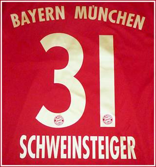
The number 31 is written in gold text, matching the accent of the jersey itself. The numbers are tall and thin; their bottom area containing the Bayern Munich crest in the color of the jersey behind it, as is the standard with most clubs and their customized fonts and decoration.


Beneath the number, the last name of the player, in this case, “SCHWEINSTEIGER”, is written in a slightly compressed text. I’m always iffy with longer names on jerseys but having sported “IBRAHIMOVIC”, “SERGIO RAMOS”, and now, “SCHWEINSTEIGER”, I can say that the text is perfectly sealed to the shirt and will in no way be a noticeable bother.


FC Bayern fontFC Bayern numbers logoFC Bayern club logo in numbers


Lastly, above the number, the title of the club, “BAYERN MUNCHEN”, is written in a smaller text than the name. I like the Club > Number > Player look on the back of the shirt.


Deeper Look on Customization and Personalization


Here’s a great opportunity for me to capitalize on the value and scale of a custom, personal jersey compared to an “off-the-rack” one.


If you like association football, you are most likely a fan of some particular club.

If you like a club, you are most likely a fan of a particular player.

If you like a player, you may be a fan of their national team and almost guaranteed, a fan of your own.


The way that tastes, preferences, and favoritism link together tend to go on and on, like a vine. That means that there are quite a few things that you like and directions that they go in.


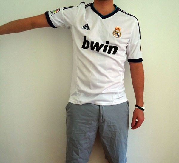
For example: I’m Spanish, I like football, I like La Liga, I like Real Madrid, and I like Iker Casillas.

In some way or another, each of those things are chained, and I have a liking to each and every subject on the way. Here’s another great example, but this time, in reverse.


I like Miroslav Klose, I like Lazio, I like Serie A, I like football, and I like Europe.

Now, these aren’t representative of my favorite things, but they are representative of what I like, and what I would be willing to display when I go out to any destination. Maybe when I go out shopping, I’ve got my 2010 World Cup jersey of Miroslav Klose for the German national team on. It’s got a team I like with “my” player and it’s just “my” size. I can sport it when I go out and know that I’m not wearing a particular brand or a certain new fashion style; I’ve got my own shirt, my own style, my own look.


The true value in having a custom jersey is knowing that it’s “yours”. Everyone has their own tastes, preferences, and opinions, and a custom jersey lets you tell the world your side of things. An authentic jersey, even more so. To be able to watch your favorite club in official competitions in your own jersey or to be able to out with a custom shirt is where the value truly lies. Back in high school, I used to go in with jerseys all the time. I’m a big football fan, and to be able show my dedication and joy for the sport by wearing a jersey of one of my favorite clubs or national sides, I had a way to express myself in my own way. It was when I purchased a customized jersey that I realized the real strength of that expression.


FC Bayern name and number kit


Wear it loud and proud; getting a personalized shirt with your favorite player, number, or maybe your own choice of name and number, is a great way to make your own look while keeping to the things you like best.


The Conclusion


Bayern Munich’s 11/13 home kit is a great piece of eye candy. It’s got a powerful red base with fitting gold accents, it’s got a sense of nobility and flair about it that speaks volumes about the strength and history of the Bavarian football club. The simpler look than those of the past has created an incredible jersey that doesn’t need to be foolishly complex to satisfy the need for a modern design. It has been, and will continue to be worn by an overwhelmingly powerful force on the football field, at least until the end of this incredible run that FC Bayern Munich are making for the Bundesliga title. The jersey is of the utmost quality, accurate to size, and comfortable to wear. The player customization is clean and bold; the printing is very good.


FC Bayern home jersey front


My final say on FC Bayern Munich’s home jersey? Well, if you are a fan of Die Roten, you should get it right now. This is the best jersey Munich has had in years; the design, the quality, and the fit are all what define the legacy of Adidas. The simplistic approach to creating Munich’s home jersey has paid off with a beautiful jersey that will look good on the field, good in the store, and good on you!


Categories
Real Madrid

Real Madrid home shorts 12-13

Real Madrid home shorts 12/13

The Real Madrid home short for the season 12-13 is white with blue stripes.

The shorts numbers are in the same style as the back numbers for the jersey.

They even include  the RM club logo at the bottom of the number.


Real Madrid home shorts 12-13


The adidas logo is placed on the backside of the shorts.


Real Madrid home shorts backside


 Also the clima cool logo is on the backside of the short. So if the shorts number is included there ornamentation front and back on both legs.


Real Madrid shorts number 7


The shorts come with a string in order to adjust the width.


Real Madrid shorts waist elastics


The strings come with an interesting detail since they carry the club name.


Real Madrid shorts strings


Categories
Misc. Clubs . . . Product Reviews

Review: FC Copenhagen home jersey 12-13

Review: FC Copenhagen 12-13 home jersey

By Christiaan Husing , San Jose, California

I enjoyed my visit to Copenhagen and have a fondness for Denmark and the Danish people. I’ve been a football fan since my youth and have amassed a large football shirt collection. I have worn many shirts from many clubs from many manufacturers.


FC Copenhagen have been my Danish side for some years. I have owned a number of FCK shirts from the early 2000s onward.


In recent years, Kappa’s line of replica shirts have not been the best for supporters. Tight-fitting, they look good on athletes but not necessary on out of shape or aged supporters! The Kappa logo, with its naked man and woman, has embarrassing connotations in the United States.


Thankfully, for the 2012-2013 season, FCK have paired with Adidas to provide a line of classic replica shirts and training wear. The 2012-2013 FC Copenhagen home shirt merges Adidas’ classic style with FCK’s recent history.


The shirt is light and features Adidas’ Climacool fabric which is moisture-wicking. I first wore it doing some cleaning work and felt just as dry after I was finished as when I put it on.


The three Adidas blue stripes on the shoulder are a classic look and the FCK emblem is embroidered on the chest. The FCK logo definitely attracts attention with its blue lion and the Danish flag makes the shirt stand out here in America. With the Carlsberg sponsors logo screen printed on the chest, nobody will mistake this shirt as being from Major League Soccer!\


Adidas shirts tend to be fond of collars, which while historical, do not please me from a style standpoint. Thankfully, this shirt does not have a collar. Unlike the Kappa shirts, the replica is cut for a more comfortable fit and will accommodate those who are thin and those who are not-so-thin!


What makes this shirt stand out more from past FCK shirts is the addition of “1992-2012” in gold on the back neck line in gold font. This celebrates the 20th anniversary of the modern FCK club.

I recommend the shirt to all FCK supporters and congratulate Adidas on their effort!


Categories
Product Reviews Real Madrid

Review: Real Madrid away jersey 12-13

Review: Real Madrid away jersey 12-13

By Rafael Valverde, Queens, NYC, USA

After a historic record-breaking season that ended with winning the La Liga title, Real Madrid returns to defend that title on this, their 110th anniversary. Adidas faced pressure in designing a quality away shirt to commemorate the occasion; I feel they have delivered.


Real Madrid ude trøje 12-13


Appearance


The official color-way of the 2012-2013 Real Madrid away shirt is Nobile-Ink/Electricity. Nobile-Ink is a purple hue that is reminiscent of navy in certain lighting. It is the same color used in the accents of the 2012-2013 Real Madrid Home shirt. Electricity is a bright neon green color that brings life to the shirt in small doses through the piping on the shoulder and the stitched Adidas logo on the right chest. The two colors combine for a superb contrast that captures attention. I feel that Nobile-Ink serves as a traditional Real Madrid color while Electricity brings modern excitement. I must admit that I was a bit skeptical when the initial pictures of the shirt were released. However, after seeing it on the field and live in person… It has become a favorite of mine.


Performance


The shirt material is 100% polyester pique. Adidas CLIMACOOL technology refers to the combination of open mesh, performance fabrics and strategically placed ventilation panels. Specialized ventilation panels are placed in areas such as under the arms and body sides to help whisk away sweat. The intention is to combat heat so that you remain dry, cool and comfortable even in the height of athletic competition. Raglan sleeves provide a flattering fit while still offering complete freedom to the arms. The neck opening is crewneck style with partially ribbed collar. I found the overall fit of the jersey to be “true-to-size.” If your intention is to be active in this shirt, you will be completely pleased with the performance.


Details


The Real Madrid badge is beautifully stitched on the left chest. The crest embroidery is quality. The Adidas logo is stitched on the right chest.


Real Madrid klublogo


Primary club sponsor, bwin is screened on the mid-chest of the shirt.


Vertical stripes are featured on the body of the shirt but can only be seen up close.


The LFP badge, (La Liga de Fútbol Profesional) is stitched on the right sleeve.


LFP ærmemærke


My personal favorite design detail of this shirt is the “110 anos” (110 years) logo on the left sleeve, which commemorates 110 years (1902-2012) of history for the club. It’s a significant and unique detail that will make this shirt feel special for years to come.


Real Madrid logo 110 anos


Printing


The official printing color is white and this does well to balance the shirt. Although white is often considered plain, the printing features subtle details to remain interesting. The Real Madrid logo is once again featured at the bottom of each number. Soft grey horizontal lines are present on each number and letter of printing. These details can be difficult to see from distance but are well appreciated up close. The numbers appear clean and sophisticated. Lastly, I really like the neat name font.


RM ude tryk Alonso 14


Conclusion


Adidas has done a fine job designing and producing the Real Madrid away shirt for the 12/13 season. The end product is a shirt that is well made and visually pleasing. The color contrast of the away jersey is beautiful, something that is much more appreciated in person. Classy details throughout the shirt and printing provide the finishing touch. Hala Madrid!


Of course, the 2012-2013 Adidas Real Madrid Away jersey and official Real Madrid player printing are now available at mmsports.com


Categories
Real Madrid

Review: Real Madrid home jersey 12-13

Real Madrid home jersey 2012-13 review

By Julian Smith, Lisbon, Portugal.

What a year Madrid have had… Los Blancos were finally able to snatch the La Liga title from the recent dominance of Barcelona claiming the honor for the 32nd time, amassing an incredible 100 points and 121 goals (+89 GD). Superstar Cristiano Ronaldo had arguably his best year in Madrid, scoring 46 goals in La Liga and a blistering 60 goals in all competitions. While they crashed out of the Champions League on penalties, Fiorentino Perez, Mourinho, and co must be happy with their overall performance. Having completed a season in such style, it’s no surprise that their 2012-13 home kit is just as classy.

The Shirt

Real Madrid home jersey 12-13

The 2012-13 Real Madrid home kit returns to the clubs royal roots with a nice combination of dark purple with turquoise lining. The new style may seem a bit odd at first glance, but it definitely grows on you and looks fantastic when worn. As always, the kit is mostly white and sports the triple stripe (the Adidas trademark) along the shoulders and down the arm.

The material is nice and soft and feels fantastic to the touch (unlike Nike’s shirts before Euro 2012). Still the standard 100% polyester seen in most replica shirts these days, it is comparable to other Adidas shirts worn in recent years.


Real Madrid home jersey arm


*Note: Shirt being worn is a medium, wearer is 6’1” and 160 pounds (1.85m, 72.5 kg)

The neck and armholes are reinforced with a double lining of the same material and weigh the shirt down a bit to reinforce the structure of the shirt on the body. An important point to mention is this double lining actually gives the arms a more fitted wear, so if you extend your arm outward the sleeve will stay up, as seen in the above pictures. 


Real Madrid home jersey 12-13 collar


Adidas opted for the flat collar as opposed to last year’s protruding collar. The divergence allows for the cool royal accenting, and now you don’t have to worry about making sure the normally flimsy protruding collar is always in place when you’re wearing it. 


Real Madrid home jersey LFP badge


The Clima Cool technology this year is incorporated in the vents placed under both arm pits.


Real Madrid garment


An interesting detail to note that is not so visible in pictures is the silver pinstripes running along the front of the shirt. The accent adds an extra bit of flair and, again, helps give the shirt a better structural look when worn.

Details

The replica shirt features the standard embroidered La Liga logo on the right arm and the plastic “bwin” logo used since the 2007-08 seasons. Real Madrid and Adidas have made to huge improvements this year, though, which I would like to highlight.


Real Madrid old logoReal Madrid new logo 12-13
Old Crest                                                                                          New Crest

A very disappointing aspect of last year’s shirt was the club crest. While the shirt itself looks great the plastic, almost fake, looking badge is kind of a bummer. This year, the badge is embroidered and stitched into the fabric, giving the shirt a much better and authentic look.


Real Madrid 110 anos logo


An addition to this year’s shirt is the “110 anos” (110 years) badge on the left arm. This neat detail commemorates the clubs 110th year as an official club since its original founding in 1902 as Madrid Football Club. Fun fact: the club only became Real Madrid (which translates to Royal Madrid) in 1920 when King Alfonso XIII dubbed them so and placed the crown on top of the club crest.


Printing

The official Real Madrid printing for the season 12/13.

Real Madrid printing 12-13

This year’s print style is probably one of my least favorite aspects of Madrid’s 2012-13 shirt. The two-tone number, in my opinion, doesn’t really fit so well with the rest of the shirts color palate, and the combination of the edged and curvy lines looks a bit awkward. 


RM printing close up


As seen in the above picture, the printing accent color and the shirt accent color are not the same. Perhaps if Adidas and Madrid had brightened the print accent color and not made it so prominent it would have looked better… 

Conclusion


Real Madrid home jersey 12-13 score


All in all, the shirt looks and feels great. Personalizing takes a bit away from the shirts stylishness, but that certainly won’t deter a true fan.

Categories
News

Book: Jeg er Zlatan Ibrahimovic

Book of the year 2012 in the world of football

“I am Zlatan Ibrahimovic” or “Jeg er Zlatan Ibrahimovic”. The book takes the reader to the very beginning of Zlatan’s upbringing in suburb to Malmo in southern Sweden. Not an easy life at the beginning for Zlatan but then he is sold from Malmo FF to Ajax Amsterdam and from there on he never looks back.


Jeg er Zlatan


The cover is from the Danish version of the book. The quote from a newspaper is from the Swedish newspaper Expressen though.

Where is the “buy here” link to Amazon ? well maybe you should try Barnes and Nobles this time around.


Categories
Product Reviews

Nike Laser Team Sport jersey

 NIKE LASER PREMIUM GAME TEAMWEAR JERSEY & SHORTS REVIEW

 By Jonne Keränen

Over the recent years Nike, along with other brands such as Adidas and Puma, has started to release the authentic player version shirts for the general replica shirt markets. From a business point of view this can be seen as an act to try to increase the profit margins of these products. For consumers this means a wider range of products that can be seen as a positive development. Basically for more money you get some added performance features but if you don’t want to spend there are also cheaper options available with the same style as the authentic ones.


Manufacturers also offer teamwear shirts with same performance features that the authentic player version shirts have – or at least they claim that the teamwear shirts have these advanced features. In this review a Nike Laser Premium Game teamwear jersey (size large) is compared to different Nike authentic player version club and country jerseys (all size large). As a bonus, a pair of Nike teamwear shorts are compared to Nike replica shorts.


Nike Laser team sport jersey orange black front


Nike Laser Premium Game teamwear jersey front.


Nike teamsports jersey orange black backside number 10


Nike Laser Premium Game teamwear jersey back.


Nike authentic players version jerseys

 Nike authentic player version shirts.


Nike team sports shorts orange number 10

Nike teamwear shorts.


STYLE


The Nike Laser Premium Game jersey basically has the same style as the current Nike Brazil shirts. From a distance you can’t really notice any significant differences to authentic player shirts. Style wise the shirt has nothing special, it might even be seen a little boring. Some people might be put off by the big panels on the cuffs.


FIT


Nike claims that the Laser Premium Game jersey tight performance fit. In reality it’s not even close. The Nike authentic player version shirts are a perfect example of shirts with tight performance fit. They hug the form of your body but are not uncomfortably tight. Depending on different types of Dri-Fit material they can also stretch a little. The Laser Premium Game jersey however has more of a fit of a normal Nike replica jersey. The fit is very loose and baggy. Of course you could buy the shirt in a smaller size but still you won’t get that tight body hugging fit of an authentic Nike player version shirt.


Nike laser jersey compared to nike authentic jersey


The difference in fit can clearly be seen in this picture.


MATERIAL


Almost all Nike football shirts are made out of Nike’s Dri-Fit material. However Dri-Fit is not a unambiguous material. Dri-Fit can be tough or soft, it can stretch or in some products it doesn’t stretch at all. If Nike says that some product is made out of Dri-Fit you really don’t know what you get before you can test the product. Though usually Dri-Fit has reasonable sweat wicking capabilities it is very light. Over recent years Nike has started to use recycled polyester in their products. Although this might be seen as a marketing trick the thought is nice.


The material on the Laser Premium Game jersey is 100% recycled polyester Dri-Fit. It’s quite close to same as on the Nike authentic player version shirts or replica shirts. It’s stretchy but you won’t get any benefits from that since the fit is so baggy. The material feels very light but not specially comfortable. The material is very thin and seems a bit cheap. Some Nike authentic shirts have some cotton added to the material (for example 12-13 Holland away authentic shirt) that makes the feel of the shirts very comfortable. The cotton can be clearly seen from the different color tone on the inside of the shirt. The authentic player version shirts usually have a bit more thicker material than normal shirts. That makes the shirts feel stronger and not so cheap as on replica or teamwear shirts. Still there is a lot of variation between the materials on different Nike authentic player version shirts. Some shirts (for example 11-12 Inter and Juventus home shirts) don’t stretch at all while some (for example 11-12 Brazil home shirt) has very stretchy material.


Nike teamsport jersey close-up orange

 Nike Laser Premium Game teamwear jersey front and back material.


Nike authentic jersey close up

 Added cotton can be seen when the shirt is turned inside out (white tone color).


 CONSTRUCTION


The Laser Premium Game jersey has different materials on front and back. On the front you have the basic Dri-Fit material and on the back a mesh panel. The construction of the shirt seems to be very simple like on any other regular Nike Dri-Fit shirt. The shirt has laser-cut holes under the arms for better heat management. This is maybe the only common thing that the shirt has with Nike’s authentic player version shirts. One additional feature that has been popular on Nike authentic shirts are plastic t-bars on the shoulders of the shirts. The purpose of these t-bars is to make the seams stronger and more durable. In addition they are also a style feature making the shirt look better and differing it from regular shirts. The Laser Premium Game jersey doesn’t have the t-bars making it feel yet more like a regular shirt. In addition the jersey has embroidered Nike Swoosh on the front. On Nike authentic shirts all the logos are printed reducing weight (although the effect is minimal in reality).


Nike Laser teamsport jersey holes side


Laser-cut holes under the arms.


Nike Holland authentic jersey shoulder


T-bar on Holland away shirt.


Brazil authentic jersey shoulder


T-bar & printed Swoosh on Brazil home shirt.


Nike teamsport jersey swoosh


Nike Laser Premium Game teamwear jersey embroidered Swoosh.


Nike authentic Holland jersey Swoosh


Printed logos on Holland away shirt.


Categories
Inter

Inter Ambassador in the Green Room

 Inter Ambassador answers questions . . .

Why do you support your current favorite club ?

For me, the first and last question are inevitably linked. As a child and budding calcio enthusiast, my favorite teams had 1 thing in common – Baggio was on the roster. From Juventus to Milan, Bologna and so on all before the age of 10 – my allegiances hopped around along with the divine ponytail.

However, in 98-99 something changed – I got internet at my house and was no longer restricted to following calcio on RAI via once-a-week public television programming. I became addicted to Baggio’s goals and magical moments.. in
nerazzurro!

I was now not only following my favorite player, but following a massive club challenging in -what was- the best league in the world.. Taking in weekly goals and highlights. Other legends of that era included Vieri, Zamorano, El Chino, Djorkaef, even Pirlo and Ronaldo; I worshiped them. 

It was around that period of time that I received my first jersey as a gift – an authentic, thick-striped Internazionale home kit. I wore it everywhere and in doing everything and still feel a sense of satisfaction whenever I have it on – that’s how I know I’m a lifelong Inter fan; my roots are deep.

Which piece of advice would you offer your club if you were present at a board meeting ?

Italian football has lost its champions league spots and must now battle in all European competitions to regain its status as a top 3 league – giving 4 of its proud clubs the chance to thrive in Europe’s top competition once again every season.

However, I regretfully must advise inter to forgo Europa league success while focusing on winning the scudetto once again. As a top squad with only one competition to focus on, inter should be able to make a strong push for the title ala Juventus of this season with no taxing commitments outside the peninsula.

Being a perennial challenger and either winning the league or qualifying for the ucl directly is the only way to attract top talent to the side and maintain inter’s proud history.

Inter have had great success in the past 6 or so years, but also have suffered some huge disappointments in that time, dips in form, manager uncertainty and an aging squad.

Many of their current troubles stem from bad club and player management and a return to “Pazza Inter” or crazy Inter – an unpredictable but always enthralling state of affairs that can end in great victory or epic heartbreak.

The best years of Inter’s past 10 seasons have seen some of the world’s top players come and go – I would suggest bringing back the man who made it all happen, Oriali. As sporting director, Oriali signed prolific talents such as Ibrahimovic, Eto’o, Milito, Thiago Motta and more – while his successor Branca has brought on flops including Zarate, Forlan and Palombo.

Last, sign Stramaccioni as full fledged manager. He’s clever, charismatic, and has the support of the players – compared to the other options out there, the man affectionately dubbed ‘Stramala’ may have a promising future at the nerazzurri post.   

What is the low point of the club while you have followed it ?

The obvious low point during the time I have followed Inter was the ___ season in which Inter led the title race until the last day.. Only to lose to bitter arch-rivals Juventus after an historic collapse. I distinctly remember seeing a soggy eyed Ronaldo on the sideline weeping as the scudetto slipped through black and blue fingers – an image we as Inter supporters won’t soon forget.

What is the high point ?

The highest highs of Inter’s success came with the 09-10 season treble: scudetto, coppa Italia AND the legendary Champions League victory over Bayern Munich.

The victory was not only a win for Inter’s trophy cabinet, but all of Italy -whether they accept it or not. In beating Bayern in the final, Inter secured the 4th and final champions league spot remain with Serie A for one more season.. Though the accomplishment was largely unappreciated.

It is also the season where a personal favorite of mine for years came to life and etched his name in the history books – there was no striker better than Diego Milito, il Pricipe, in 09-10. Period. 

Which is/are your favorite jersey(s) from your club ?

For me, this question is a very tight race – and would have to be a draw in my eyes between my very first Inter jersey or 98-99 and the 09-10 shirt.

Purely on aesthetics, the 09-10 shirt wins with its smart stripes and tight ribbed collar.. Though the 98 shirt comes close with the bold, chunky black and blue stripes – my mind often wanders back to the champions league winning shirt being that it is the collector piece I do not have! Help me MM Sport!!

From a nostalgia standpoint, one shirt is what Baggio wore as he roared like lion, the other Milito donned as he twirled like dervish – its a tie!

When you were a kid which player would you like to become ? or who was your favorite player ?

As stated numerous times in this interview, my favorite player since I began following calcio has been Roberto Baggio – divin codino.

I idolized him as a youngster in 1994. I followed him throughout his career and thought that I was his biggest fan – only to learn that every fan of calcio was also -without exception- a die hard Baggio fan.

As an aspiring soccer player, trying to star on my high school team with all my might – I turned to Baggio. I purchased his career highlight vhs in the Le Stelle di Calcio series title Baggio – il Divin Codino and watched it
religiously, studying and learning each of his moves and using them to great effect against my opponents on the pitch.

I had even purchased his autobiography, Una Porta nel Cielo (written in Italian) and had my father read and translate it to me – a little bit each night – until he grew tired of the scholarly undertaking and I was forced to become a strong Italian language scholar myself to continue learning from Baggio in his own words.

Being a die-hard Roby Baggio fan has shaped a lot of my young life! Will there ever be another like him.. Surely not. I hope that he will turn to manage the nerazzurri sometime soon.