Categories
Misc. Clubs . . .

Premier League name and numbers black/white

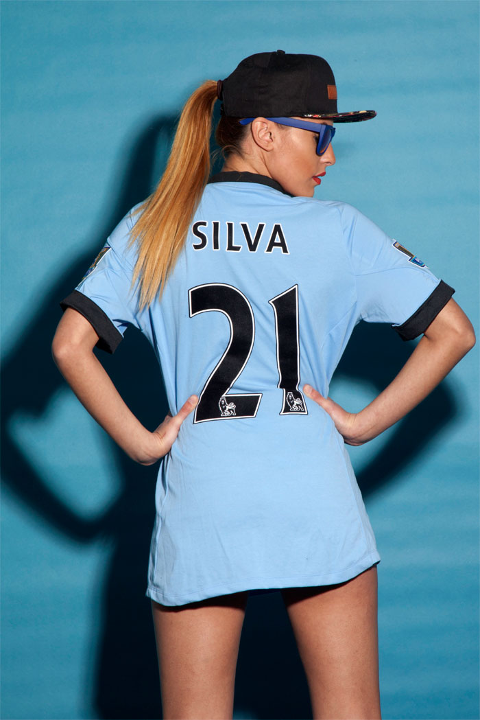
Manchester City name and numbers | EPL kit black/white

The second most popular color variation of the Premier League names and numbers is the black/white variant.

The by most widely used is white/black while navy, red, and gold are used rather seldomly.


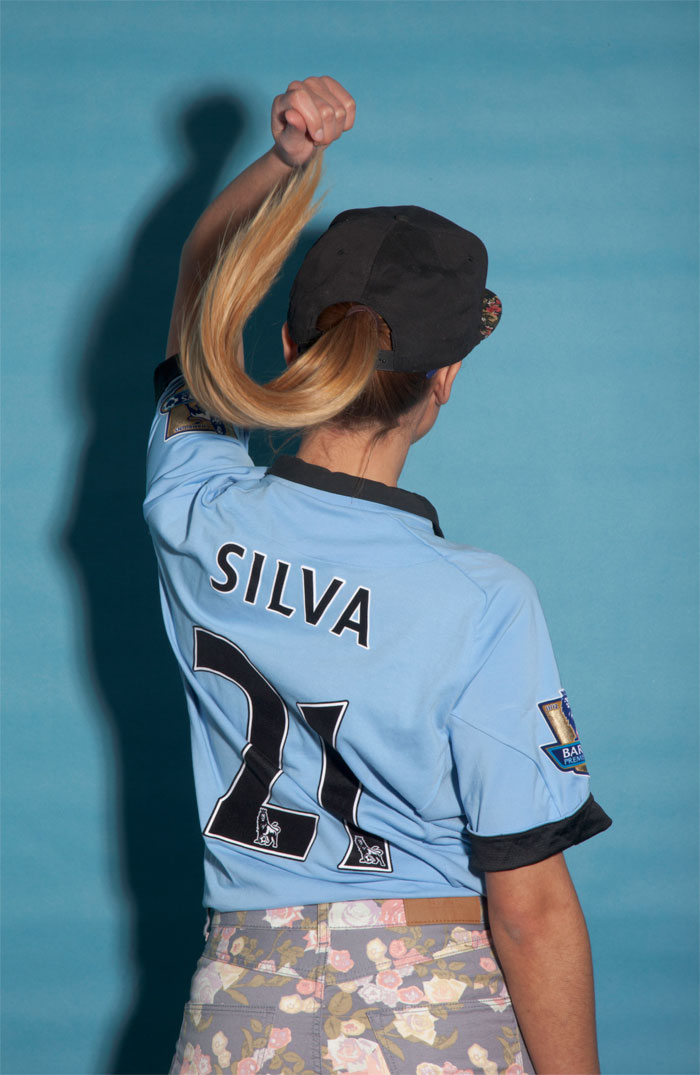
Man City girl displaying the EPL names and numbers


and lets look at the plain letters and see how they look like when applied to the garment.


Man City EPL names and numbers

Categories
Product Reviews Valencia

Review: Valencia CF away jersey 11-12

Review: Valencia CF away jersey 11-12

By Peter Locascio


The review features the Valencia away jersey for the season 2011-12. The format of the review does not allow it to be included successfully in a blogpost. Therefore the review follows on an external page.

Click on the banner here below and you will go directly to the review. Disclaimer! By clicking the link a new window opens up.


Click here to read the review of the Valencia away jersey 11-12


Categories
AC Milan Product Reviews

Review: AC Milan soccer tee

 AC Milan Soccer Tee Review

 By MM Sports AC Milan ambassador Enrique Madrona Jr. 

Outside of the realm of jerseys, AC Milan’s line of additional merchandise encompasses a diverse selection of products right for particular fans. For review, courtesy of MM Sports, I received the AC Milan Soccer Tee from Adidas. So, what is there to say about this shirt from the 2010/2011 Serie A champions?


AC Milan tee cotton black


The Look


This Adidas shirt is just as it looks; the base color is black and the entire shirt is just that. This tee does not try to do anything new or experimental, but in doing so, Adidas has perfected the art of the general shirt, and in their long line of official club shirts, what differentiates these products are the designs.


The back of the shirt, as well as the sleeves and all edges, simply displays black. This is all to bring the attention to the urban styled design on the front chest area. The lowest layer of the visual design shows the enlarged number, “1899”, representing the year of AC Milan’s creation. The text has abstract cuts and slashes, with a cool, almost urban design. Overlaying “1889” are five white lines, treated with the same look as the numbers below. Once more upon the previous layer, the recognizable Adidas emblem shape, the rounded triangle found on the bottom side rims of their jerseys, sits upon the white streaks and red year number. This shape is filled in black and upon a red line running across the middle sits the eye catching AC Milan crest. The layered look is refreshing as Adidas opted to use such a design in place of a simpler, colored shirt with just an emblem. Above the front reads the text “AC MILAN” and finally, the Adidas logo on top. Together, the shirt portrays a great representation of AC Milan, using a combination of Milan’s signature black, red, and white palette. Having the design enclosed within a sea of black is a great look that puts the focus on the sleek imagery.


The Fit


Adidas’s careful attention to physical fitting on their jerseys is not lost here. This AC Milan soccer tee is lengthened to give a great slim look and it fits fantastically. I have many large sized shirts and they all feel a bit oversized; this tee fits a bit tighter on the upper-torso, and extends downward a little farther than most shirts. The result is an apparel product that can look really great and stylish if the right size is purchased.


The fabric is very smooth, properly assorted through the sleeves and chest to keep it comfortably tight. It never feels too tight or movement impairing and truly, like all shirts, it all comes down to picking the right size. I would recommend that those that dislike light tightness to just pick one size larger. In terms of touch, Adidas shirts are always maximum quality at great prices, and that is exactly what you’ll find here; very smooth material that’s great for any occasion.


Like all fans, I love jerseys, and they are almost my primary matter of apparel for representing, but when it’s not match day and you want that subtle fan look with great comfort, these sorts of shirts are the ultimate solution. Along with other merchandise, this shirt can help you show your “Cuore Rossonero” at a great price. I recommend all AC Milan fans to grab this shirt now; the mixture of classic il Diavolo colors, the low price, and the casual comfort are all great positives of this product!
Categories
FC Barcelona Product Reviews

Review: FC Barcelona away jersey 11-12

 Review: FC Barcelona away jersey 11-12

By MM Sports’ FC Barcelona ambassador Ph.D Gerard A. Banez, Ohio, USA


Introduction:

So, after another year of collecting more domestic and international titles, what does FC Barcelona do to top its most recent successes? On the pitch, the club adds more rising stars, like Sanchez & Fabregas, to ensure that it continues to win titles in the future. Off the field, the 2011-2012 campaign kicks off with another line of stylish & contemporary Barca merchandise. My focus here will be the new 2011-2012 Black Away jersey.


FC Barcelona away jersey 11-12 front


The Look

My first reaction to this jersey was that it looks a lot better in person than it does on the website. I like the color black as much as anyone, but, to me, the black jersey looked boring on the website when compared to the mint, orange, and yellow of past Barca away jerseys. Seeing the jersey, though, changed my opinion. The 2011-12 Black Away jersey is very stylish & contemporary in appearance. The black is sharp. The jersey features a unique and attractive neckline (see photo). The dark grey striping on the sleeves (photo) adds to its sporty appearance. As far as the Qatar Foundation logo, I know that many supporters have strong feelings about Barca taking on any logo. Though I won’t try to change your opinions on this, what I can say is that the Qatar logo isn’t that bad. It is subtle and distinctive in appearance and does not jump out or detract from the overall look. The “good” logo, the Unicef logo, is now on the bottom half of the back of the jersey, beneath the player number. Mes que un club (more than a club) is on the inside of the back collar, and tots units fem forca (all together we are strong) is in its familiar place on the inside of the jersey behind the FCB badge.


FC Barcelona away jersey 11-12 Xavi 6


The Cut

This jersey runs about true to size. It fits much like my 2010-2011 Barca home jersey. It is a Nike jersey, and, in my experience, the Nike jerseys are more relaxed and not as fitting as the Adidas jerseys. I personally like their more relaxed fit.


FC Barcelona away jersey 11-12 chest


The Feel

The jersey is made in Nike Dri Fit fabric. I have always liked the texture and substance of Dri Fit and prefer that it is not as clingy as Clima Cool.


Bottom Line

In a very short time, I anticipate that the 2011-2012 Black Away FC Barcelona jersey will emerge as one of my favorite soccer shirts. It is sharp, and it is sporty. In black, the shirt is more dressy and not as jersey-like, giving it added versatility. I highly recommend this jersey to any Barca fan and to anyone who likes good-looking, well-made soccer merchandise.  It represents yet another FCB victory.