Nike Manchester City away jersey 2013/14
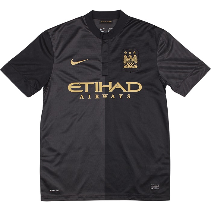
The spell with Umbro ended in 2013 and Nike took over from July 2013. The first Nike collection for Man City included a sky blue home jersey, a black away jersey, and a white European jersey.
Below the away jersey with black, anthricite, and gold theme. Only prob City did not win the Premier League so they would not be wearing the Gold Champs badges throughout the 13/14 campaign.

A nice touch though would be that the club had chosen the Gold/White font for the away jersey shown here above.
White/Black could also have been chosen but gold is of course the right way to go taken into consideration that the contrast color chosen is that of gold.
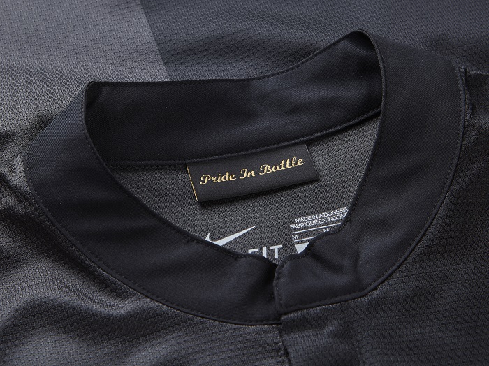
Stylish looks for the Citizens. Also when it comes to the design of the collar which is pretty low key but with buttons making it a class act anyway.

Pride in battle ? not sure where that came from but cool if the Citizens are ready to fight it out on and off the field.

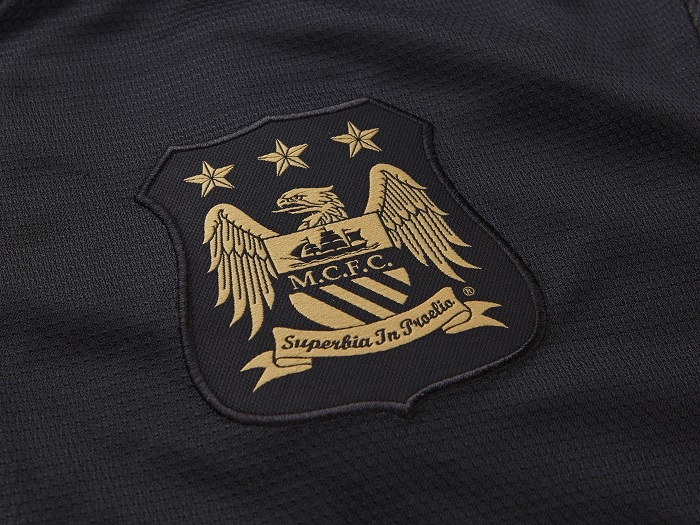
The 3 stars above the crest ? well, City is not even close to having won 3 Championship titles. No European trophies so far. A couple of FA Cup titles but that hardly entitles the club to place 3 stars above the logo. So what is it about ? pure ornamentation . For the beauty of a star. Simply that.

