Juventus Home Jersey 2013-14 Review
by Julian Smith, NYC

No league has been so dominated by a single team than Juventus in Serie A. While Milan and Inter have slowly declined over recent years, only Napoli has moderately matched Juventus’ growth (arguments could be made for Roma and Fiorentina as well given their position in the table this year). Juventus’ recent activity in the transfer market has been very effective; undisputedly the best team in Italy by a large margin and 9 out of their 11 starters were purchased from the summer of 2010. The traditional powerhouses are clearly getting tired of seeing Juve at the top of the table, and this author would not be surprised to see big money moves this summer from at least Inter (Vidic is already on his way from Manchester United).
The Juventus shirt is ubiquitous; a design recognized by all fans of the game and unchanged in recent history, at least since the 1970’s, but probably earlier. Still, even with the ever-present black and white stripes, the North Italian club always seem to introduce minor but noticeable (either visual or material) design changes that make the shirt worth buying year after year.
The Shirt
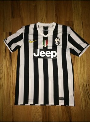
Juventus’ 2013-14 home shirt sticks with the traditional black and white stripes going vertically through the body and sleeves. From a material standpoint, this shirt is perfect. The material is soft, it has a comfortable feel when worn from the slightly above average weight, and the multitude of tiny holes makes the shirt is very breathable.

The shirt lies nicely on the body, but it should be noted that it is skinnier around the stomach than most shirts.
Details

The collar is a hybrid circle/v-neck opening, which gives it a nice, classy look. The stitched badge is sown in, which I much prefer to the imprinted badge I have seen on other shirts. The sponsor material, which has remained constant since Juventus signed the deal with Jeep, is basically a sticker which has been stamped on the front of the shirt. It is bulky, and does not feel nice with the rest of the material, and I could absolutely see it wearing/cracking over time.
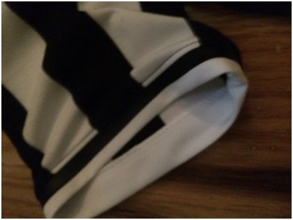
One of my favorite details of this shirt is the sleeve openings. I love the design of how the stripes end and the hole opening is cuffed first by a black rubber like stripe followed by the white regular shirt material. The contrast of colors and materials makes it very aesthetically pleasing.
The official Serie A badge is still the same gum/felt hybrid material. It is sturdy and heavy, feeling like what professional athletes should wear in real matches.

Printing
Juventus has elected to keep their print font/style constant from last year, which I quite like. The font is basic, and the letters and numbers are large, making for an easy read from near or far.


Another point to note is how the design of Juventus’ shirt has been altered to accommodate the print. When printing letters and numbers on striped shirts, the end result can look ugly because visually, there is too much going on. I much prefer to see how Juventus has done, with the space opened up for printing. It may look a bit vacant on an un-printed shirt, but I always say you should print every shirt anyway!

I feel like I say it too much on this blog, but this is another of my favorite shirts I own (although I do tend to review only my top choices!). From a material standpoint, it is in my top 2-3 shirts of my collection. The design is also top class, but they are somewhat limited in keeping tradition, although they did a wonderful job this year. I truly hope Nike continues with this material blend for future shirts.
As always, the official kit and printing are available to purchase from MMSports.