Brazil 2014 Home jersey Review
By Julian Smith, New York City
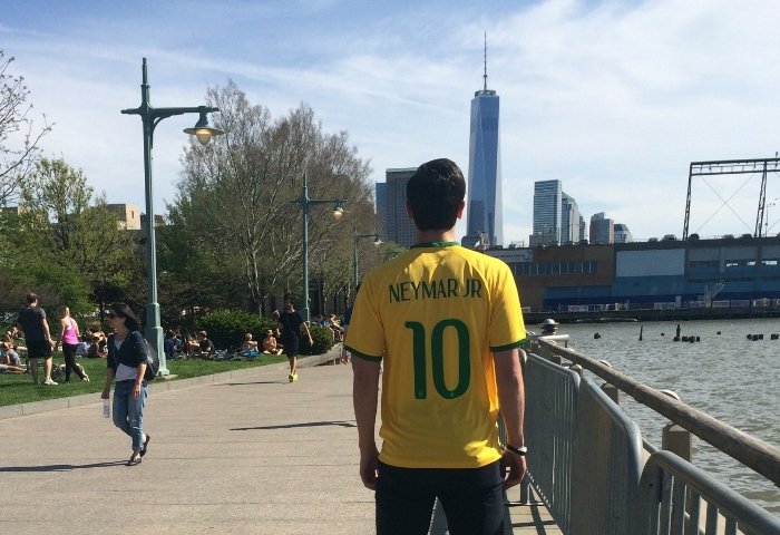
Authors Note: I wanted to take my cover picture of this shirt with New York City’s Freedom Tower, as I thought it was a poignant comparison with Neymar. Both are new symbols of hope for their respective admirers; showcasing a new age of strength and dedication that inspire their people.
The day has finally come: football is coming home. A number of countries have pseudo claims to “owning” football: England say they invented the beautiful game, Uruguay hosted and won the first World Cup, Germany have the most top four finishes… but football transcends no culture more-so than in Brazil. Football seems to be as necessary to the Brazilian way of life as air, samba, or feijoada: it is simply an integral part of the collective people’s soul. To say the hosting of this event has been a long time coming is a bit of an understatement… the last time Brazil hosted the World Cup was in 1950, and they have not finished in the top four since their victory in South Korea/Japan 2002… and it could not be coming at a better time. Brazil certainly slumped since 2002, but new talents are making their way to Europe and showing why Brazil is the ultimate footballing powerhouse. They are led by the electric Neymar whose natural ability is undeniable, but leadership is yet to be proven. This will literally be a once in a lifetime opportunity for the young star to become a Brazilian legend; and so early in his career.
Thankfully, Nike has produced an excellent shirt that Brazilians, both players and fans, should be proud to wear. Classic colors, simple design, and just a little flair is a safe, but reliable path to take, which is just what they needed for such an important moment in the country’s history.
The Shirt

Brazil’s 2014 home shirt has all the characteristics of what made people fall in love with “A Amarelinha”. The bold yellow primary color with green trim has been the staple of the national team shirt for decades now, and this one is no different. The main aesthetic highlight of this year’s shirt is the trim on the collar, which almost looks like a tongue drooping down the point of the V in collar.
The material is unbelievably soft and comfortable to wear. The weight falls somewhere in the middle of other shirts I own… light enough to wear when playing, but heavy enough to not feel flimsy.
If I were to suggest one change, it would be that I wish Nike had made the body a little bit thinner, since, depending on the wearer’s body time, the way the shirt lies can look a bit awkward.


*Note: Shirt being worn is a medium, wearer is 6’1” and 160 pounds (1.85m, 72.5 kg)
Details

The emblem of the national team is stitched in, along with their five stars.

The sleeve openings also have the green trim, giving some nice extra flair.
There are almost no extra enhancements to the shirt (i.e. underarm ventilation, multiple fabrics, etc), but they almost seem unnecessary since the shirt is quite well made.

Inverting the shirt reveals two interesting “hidden” details. The first, is a symbol of a canary on the back of the neck. This is a reference to one of the team’s nicknames, “O Canarinho”, which translates to “The Canary” in English.

The second hidden, more interesting detail, is behind the emblem. A mosaic pattern has been stamped on, with the text “Nascido Para Jogar Futebol”, which translates to, “Born to Play Football” in English. I have researched the reason for the mosaic pattern and cannot find any real symbolism to it… any insight would be greatly appreciated!
Printing

For those who have read my reviews in the past, you will know I am very particular when it comes to printing. I am quite happy with Nike’s font design for this World Cup, and it looks especially good on the Brazilian shirt (as opposed to, say, Portugal’s home shirt, which doesn’t look so good).

The numbers are what really stands out, styled with a lighter green border and pinholes throughout the bulk. The national emblem has also been stamped at the bottom of the numbers in the same lighter green.

My only criticism in regards to the font is the letter style seems a bit inconsistent, giving it a strange look upon close inspection. Some areas of the letters are narrower, while others are fatter (see “N”) and some have exaggerated aspects while other letters are understated (see hole in “R” vs loop in “J”). Generally a pretty minute detail, and thankfully it doesn’t take away from the shirt.

This shirt is almost flawless (which is why it truly merits my first 5 star review; no pun intended!). This is truly a shirt any collector should own, not only for its look and feel, but also its significance.
As always, the official kit and printing are available to purchase from MMSports.