Denmark participated at the World Cup for the first time ever 40 years ago, 1986 in Mexico. Therefore it would have been very fitting if Denmark had qualified for the World Cup 2026 in order to commemorate the event. Hummel did not follow through though with a jersey resembling the 1986 legendary kit. Instead it was a more minimalist look which came out. Though the biggest scandal ended up not being the kit design but rather the on field performance. Denmark missing 3 match points: Belarus, Scotland, Czech. A win in either match could have sealed it and sent the team packing, not to go home to watch from the sofa, but to go on the plane to Mexico / USA. But it did not materialize and the disappointment was to be felt everywhere. But the kit stands will not be redacted but will fill out as placeholder until 2028.
The Quiet Mourning: Denmark’s 2026 “World Cup” Home Jersey
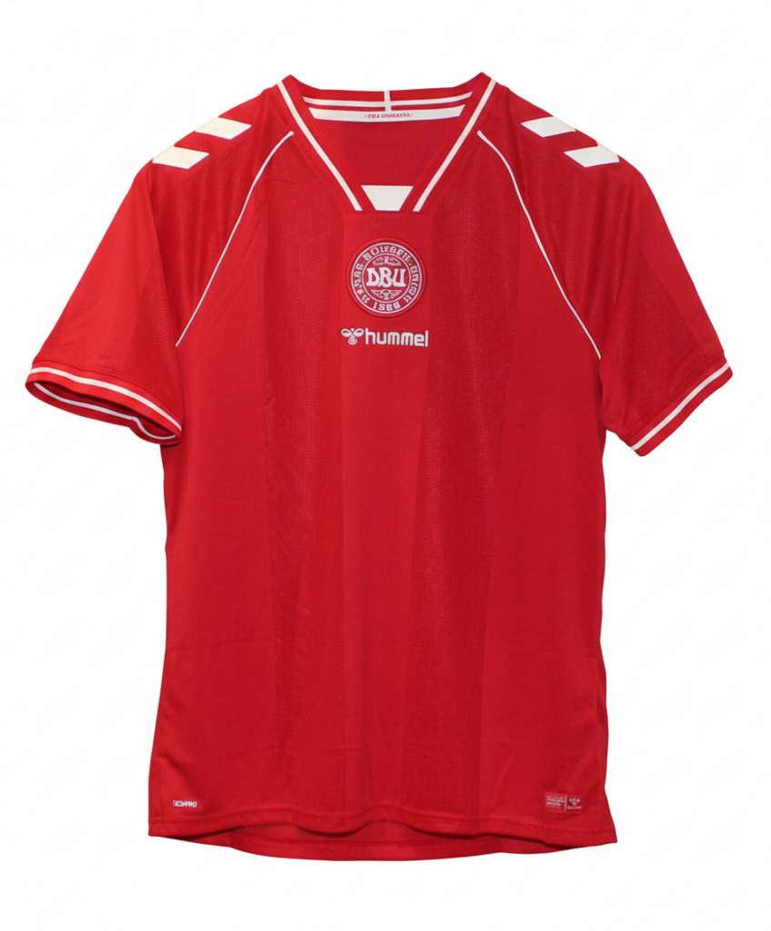
There is no brand that understands “National Identity” better than Hummel, and for 2026, they reached into the very soul of the Danish Dynamit. But instead of exploding on the world stage in North America, this “Tango Red” beauty will be a quiet reminder of what happens when “narrow margins” go the wrong way.
1. The Centralized Heartbeat
The most jarring and effective design choice is the centralized alignment. For the first time in years, the DBU crest, the Hummel wordmark, and the “Bee” logo are stacked vertically right down the middle of the chest.
- The Posture: This isn’t just a layout; it’s a statement of unity. It gives the shirt a symmetrical, iconic posture that feels more like a superhero’s suit than a football kit.
- The Irony: It’s a design that screams “Look at us,” yet the world won’t be looking at them this June.
2. The 1986 Ghost (40 Years Later)
2026 marks the 40th anniversary of the legendary 1986 “half-and-half” jersey—widely cited as the most influential kit in history. While the away kit goes full retro with pinstripes, the home jersey uses subtle tonal stripes that only appear when the light hits the fabric just right. It’s a “hushed” tribute to the Roligan movement of the 80s—a time when Danish fans transformed the national flag into a global symbol of fair play and joy.
3. The Return of the V-Neck
After years of crew necks and experimental collars, Hummel brought back the sharp, white-trimmed V-neck. It’s a look that hasn’t been seen since 2017, and it instantly makes the players look more athletic and ready for battle. Combined with the signature chevrons on the shoulders, it’s a kit that feels perfectly balanced. It’s “Clean, Modern, Danish”—three words that would have looked incredible under the bright lights of a stadium in Toronto or Atlanta.
4. “For Danmark” (The Hidden Message)
Inside the neckline, hidden from everyone but the player, is the Danish flag and the inscription “For Danmark.” It’s a personal touch meant to inspire the squad in the “pressure cooker” of the playoffs. Now, that inscription feels more like a bittersweet dedication. It’s a kit that was built for the people, for the fans, and for the flag—but the flag will be flying at half-mast this summer.