Three consecutive Premier League runners-up finishes. A Champions League semi-final run that beat Real Madrid and then fell apart against PSG. Brilliant football, no trophies. Arsenal head into 2025/26 as the side everyone expects to finally close the deal — and Arteta has responded to the pressure with the most emphatic summer statement of his tenure: Viktor Gyökeres, 54 goals last season at Sporting, arrives for a guaranteed £55 million and takes the number 14 shirt. That is not a squad number assigned by default. Fourteen is Thierry Henry’s number. It is a statement of who Arsenal think their new striker can become.
The away kit lands in that same spirit of ambition. This is not a shirt for people who want to blend in.
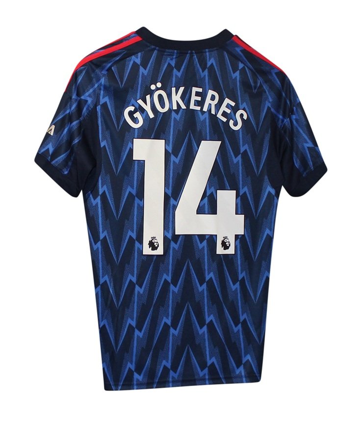
The Shirt
The base is a deep navy, and over it adidas have laid a bold lightning bolt graphic in a brighter, more electric blue. The pattern is dense, graphic, deliberately loud — and it is directly referencing the 1995/96 Arsenal away kit, with the lightning bolt motif drawn from the crest of the Royal Arsenal Gatehouse. Whether you love this or find it too much will depend entirely on how you feel about away kits in general. My view: away kits should take risks, and this one does. It is the kind of shirt that looks genuinely striking under floodlights, which is, after all, where Arsenal away days tend to matter most.
The red adidas three stripes on the shoulders provide the only strong colour contrast, and they work well against the dark base — a reminder of who Arsenal are even when they are not in red and white. The collar is a simple navy crew neck. The cannon crest, the adidas logo, and the Emirates FLY BETTER sponsor are all rendered in silver, which keeps the chest clean against the busy body pattern. The fabric is adidas AEROREADY — breathable, moisture-wicking, built for performance rather than show.
Details
The cannon crest on the left chest is embroidered — a detail worth confirming on any kit, and one that is easy to take for granted until you encounter a shirt where it is not. On the right arm sleeve, the standard Premier League badge sits in its usual position. Arsenal are not wearing the gold champion’s version this season, which only adds to the sense of a club with something still to prove. The badge here is motivation as much as decoration.
Printing
The name and number printing follows the Premier League standard: white lettering with a bold black outline. It reads clearly against the dark navy, which is one of the genuine advantages of a shirt this dark — the printing pops without effort. The example below shows Gyökeres and #14, and I will say: this is one of the more obvious name-and-number choices on any shirt in the league right now. If he delivers on the goals he scored at Sporting, this will be one of those prints that ages well.
Conclusion
This is not the shirt for everyone, and it does not try to be. The lightning bolt graphic is bold, the heritage reference is earned, and the navy-and-blue combination gives Arsenal’s away games a completely different visual identity from the clean red-and-white at home. For collectors, the 1995/96 throwback and the Gyökeres #14 chapter make this a legitimate piece of history in the making. For Arsenal fans who have spent three years watching their side come so close: this is the away shirt for the season that is supposed to be different. Four stars.