Anmeldelse: AC Milan hjemme trøje 12-13
Review: AC Milan home jersey 12/13
By Enrique Madrona Jr., Ohio – USA
With a new season comes a new jersey and in the case of Italy’s AC Milan, designers have chosen to shake it up once more in search for the ultimate devilish style for the Rossoneri. With the debut of a new and daring season for a squad that has suffered a grand migration of players, both legends and stars alike, Milan hits the field with a sharp look that expands upon the designs of recent years. Milan’s young and fresh squad has suffered some bitter defeats and unlucky chances so far in this 2012/2013 season, but like the Rossoneri squad, the season is young and there is quite a bit of time to improve and show the true potential of the new AC Milan. Fans can anticipate a season where we will see the best squeezed out of this set of players and hopefully, the return of the goal scoring menace, Alexandre Pato.
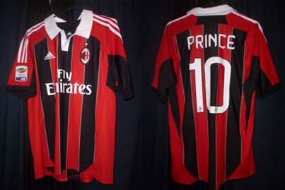
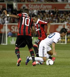
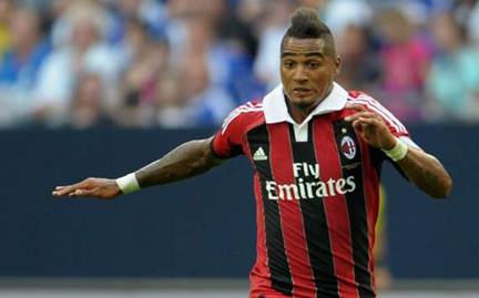
(Boateng photograph courtesy of Getty images.)
The Look
As a proud wearer of AC Milan’s home jersey for the last two seasons, in which the Rossoneri won the league and then finished second, I can note and appreciate the particular details that adorn this new home kit’s shirt. For me, the 10/11 home jersey was a case of “Love at first sight”, and the 11/12 jersey took a few matches to really get my attention, but this year’s Milan jersey is, in my opinion, up there among the best Milan home shirts in recent history.
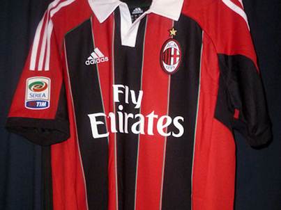
Red and black Stripes are ALWAYS the primary subject of AC Milan’s home jersey and this year, they have once again reverted from their previous design. For Milan’s 10/11 home kit, large stripes were used all around the jersey but it was clear that the jersey’s primary focus was an extensive use of black. Last season, the 11/12 kit sported small and organized stripes that were focused on the front and the back of the jersey. The jersey’s base was red so the presence of black was not quite as strong as it had been before. This year, the home jersey takes a step back and puts a greater emphasis on the black tones while taking some design ideas from last year’s white heavy jersey.
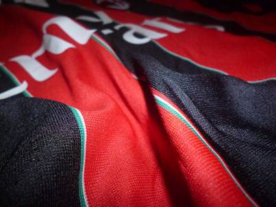
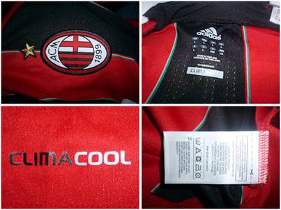
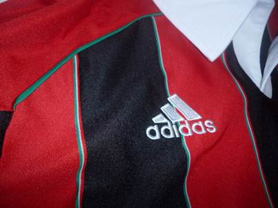
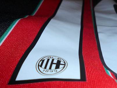
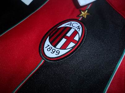
The new kit sports a five-stripe design on the front and the back with three black stripes and two red ones. This design brings the black to light much more than last year and goes back to a larger stripe design that I think is more appealing both on and off the field. The stripe design is completely bordered by a thin trim sporting the colors of the Italian flag; even more, each individual stripe is sided with a vertical tri-color stripe of the Italian flag. This use of the Italian national colors is a really nice accent of an already attractive design and it looks spectacular whether you are up close or far away. The Italian colors outlining the stripes look very nice and the design makes jerseys of recent seasons look void of detail where the stripes meet. Milan has always been heavy in the use of their nation’s colors in their kits and the green, white and red of Italy is used to outline several parts of this cool and classy jersey.
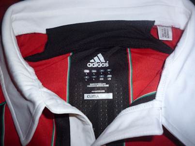
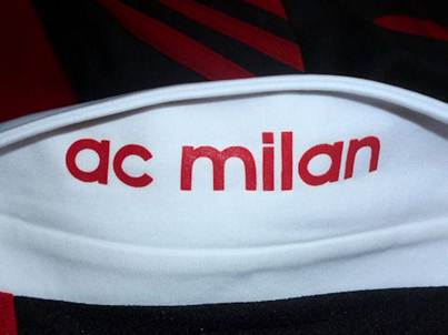
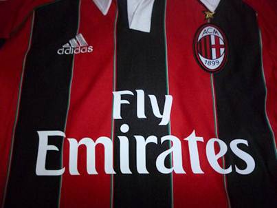
For a few seasons, Milan’s away and third kits have been toying with the concept of collars on and off and finally, they have brought it back to the home jersey. Sporting a great white collar, Milan’s new home jersey shows how much the use of white has penetrated into the soul of Milan’s designs. Last year’s white shoulder stripes are back and they make Adidas’s signature three-stripe design stand out; the design stems right from the matching collar. Flip up the collar and you will find the text “ac milan” on the back of the neck, a nice little addition to the look.
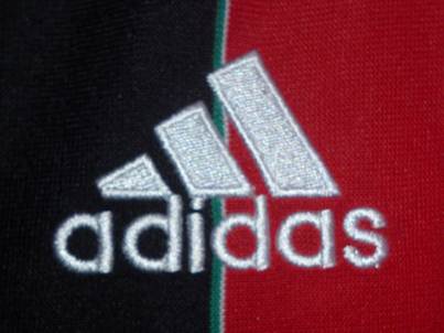
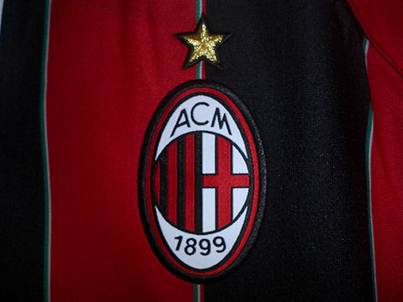
I am a fan of sleeve designs that end in a ring design, like last year’s bold and white sleeve cuffs, but I do find myself an even bigger fan of the new jersey’s sleeves. The ends of the short sleeves are rounded in the same black shared across the jersey and in fact, it is linked with a black segment of the under-arm area. This is a replacement to last year’s stripes that ran all over the sleeves too. Now the design has a sleek “red on the top, black on the bottom” style that further incorporates the red and black design into the jersey.
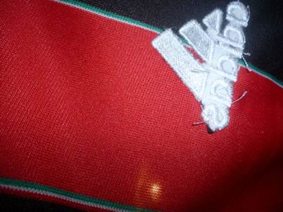
Overall, I think that this year’s look is simply one of the best ever. It gets the best features of recent jerseys: a greater emphasis of the black and white base while adding some great white accents, and blends it all together into a new look that comes off as fresh and classic at the same time. The Adidas and Fly Emirates logos in white go well with the collar and Adidas stripes and it helps to keep that composed look rather than the occasional discolored sponsor slapped onto an incompatibly designed jersey. Everything is seamless here and I have no negative comments whatsoever.
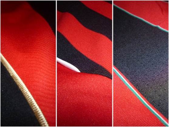
( A comparison of stripes over the years. In order of appearance: 10/11, 11/12, and 12/13 home jerseys of AC Milan.)
The Fit
The 11/12 home kit that Milan sported last year was top-class in terms of fit and comfort. The new Milan jersey improves upon the changes brought last year while returning to the larger stripes from before. The fabric of the jersey has been, in all parts, thinned. The separate large stripes no longer had drastically different compositions, as was the case for the home jersey for the 10/11 season, and it is extremely comfortable to wear. I would say it is a bit better than last year’s simply because, by comparison, the thin composition of the new jersey makes it a little better in all aspects of comfort and feel. The biggest change is the collar and I can confidently say that it is actually well done. Collars are a make-or-break sort of feature and in this case, I would say that it does not hinder the wearer at all. This new, big collar is not as seamless as the one on Milan’s 11/12 third kit, but it will not be a bother to deal with as you sport this great new kit. I have worn the jersey while out shopping for a bit, I have also checked it out with greater intensity playing some recreational football outside, and I cannot complain. Adidas dealt with the collar well and it is not a cause of concern for those worried about movement, athletic or otherwise.
The Extras
The jersey that I received for review included the latest Serie A league patch on the right sleeve. I have a couple of Champions League AC Milan jerseys but I have not yet had a chance to see what the Serie A patch is like; thanks to MMSports, I have the chance to cover it here in this review!
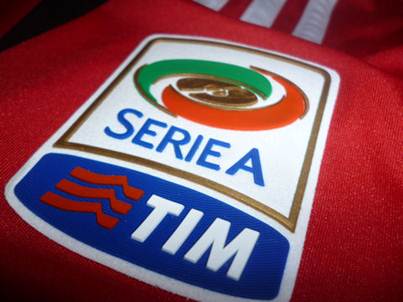
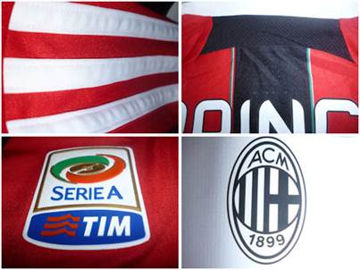
I have a couple of La Liga jerseys as well as a Bundesliga one and their patches do not quite match up to this one. Here in the United States, the well-known merchandise vendors for football, Soccer.com and World Soccer Shop, both sell jerseys with flat, fabric league patches. I was surprised to find that the Serie A patch on the AC Milan jersey I received from MMSports was incredibly detailed and layered. It is well attached onto the jersey and does not feel like it would tear off easily, unlike the league patches on jerseys I have purchased from vendors over here, though that could simply be a matter of which league patch it is.
Outside of the material, I can say that league patches are always a nice touch on all club jerseys and I would consider a “must-have” when purchasing any of AC Milan’s jerseys. The Serie A patch is already great looking and like La Liga’s patch, it is generally white with a nice touch of colors in its design. Briefly put, league patches are necessary for fans; watching all of the league matches just feels better with a league patch on your arm!
The Customization
Once again, due to the generosity of MMSports, the jersey I received for review included some great personalization; the name and number of Kevin Prince Boateng, now number 10 on AC Milan’s squad.
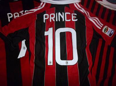
An almost guaranteed starter, Boateng is arguably among the best players in Milan’s squad and that has been the case for the last couple of seasons as well. With the loss of many players over the summer, Boateng has become a new dependency for Milan. His versatile skill and ability with the ball make him a prime player for the new Milan. This season will be a rejuvenation season for him as he will have to become the creative lead of Milan’s attack. He is the only one who can take over the position now left barren from Ibrahimovic’s departure. He needs to create dangerous attacks and deliver during offensive shifts.
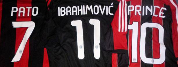
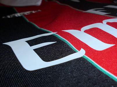
The biggest change to Milan’s personalization this year is the font. The bubbly and rounded font of last year is gone, and the square, digital-like font of the 10/11 season has not returned. This year, Milan opted to go with a sharper, thinner look that I believe emanates a lot of class. Last year’s font was nice but this year, it is serious. I am a big fan of this look and it is difficult to determine which of Milan’s recent styles is best, but I think it relates a lot to the jersey. This year’s name and number detail is perfect for the more elegant, classy look that this year’s jersey sports. The small black Milan crests are still in the numbers and they look as good as they always have!
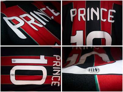
The quality on the printing has improved substantially. The characters are thinner and appear to be more smoothly melded to the jersey’s fabric. The thinness in particular means that you feel less of the abrasion that users of last year’s Milan kits may remember. It was not much to complain about but once you put the new kit with the new Stilscreen printing, you will appreciate the quality, I can guarantee that.
I really do think that the name and number personalization, particularly because you can choose from a great selection of world-class players, is a big plus to the jersey. Since the text and numbers are white with a thin black outline, it helps to further expand the use of white on the jersey, a design shift that I think is making Milan’s jerseys even better year after year. For the premium prices that jerseys already cost, I think the personalization, particularly if you are a big fan of the club or a player, is a smart purchase.
Conclusion
I find myself having a tough time saying this, but here it goes: I like this jersey much more than the last two. I loved the 10/11 jersey for it’s majority use of black and gold accents, but it had some questionable fabric differences with the stripes and was, in general, a bit think for many uses. I was impressed by last year’s 11/12 jersey, the thin stripes grew on me and the Scudetto shield was an automatic seller, but I felt that the ring neck was a bit of a step back and the material was still a little bit thick. This year? Everything is just right. The jersey gives off an aura of etiquette and flair; it defines Milan and its history. The little details, such as the white collar and the Italian flag stripe splitters, really bring out the best of the jersey. Lastly, the material, thinner than that of previous years, is consistent between the stripes and very comfortable for casual or athletic wear. All in all, Adidas has once again proven why it is among the world’s best sporting merchandise producers, and I am a happy fan with another fantastic Milan jersey worthy of a purchase by all Rossoneri fans. I highly recommend that you buy this great jersey for yourself or an AC Milan fan close to you, and get the league patch too, it is worth it! Thank you MMSports!
Køb AC Milan trøjer her!
Klik her for at se AC Milan trøjer
