Categories
Design News

New EPL 23/24 name and number font

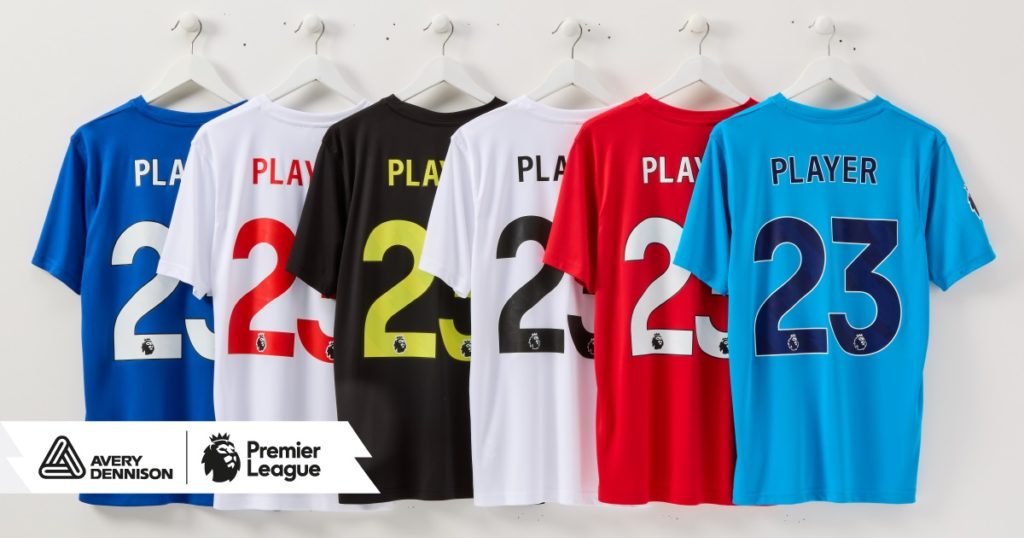
The Premier League will change font starting with the 23/24 season. The current design has been in use since 2017.

Click here to see the full press release from Avery!

5 standard colors seems to be the playbook once again. In the photo you will see 2 x white, most likely just to show how it looks like on a blue, red shirt respectively. Accusations of Curry favoring red / blue teams are thereby taken off the table.

The sleeve badge seems to have seen a bigger overhaul than the letters and numbers.

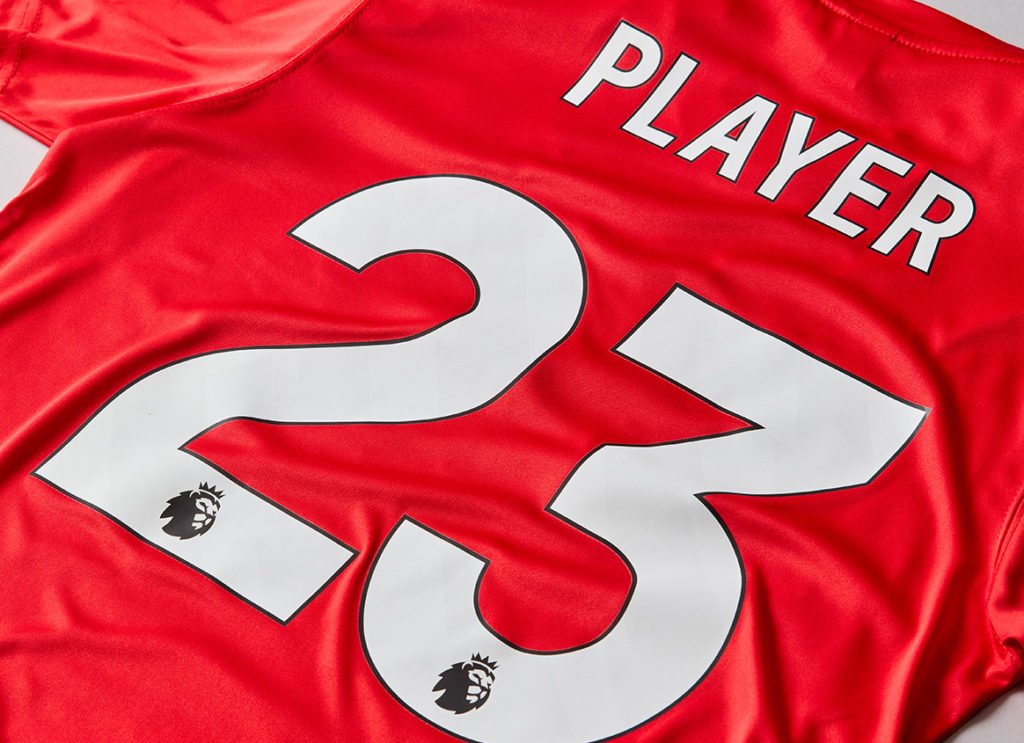
The biggest change to letters plus numbers is that the numbers now come with a pattern engraved.

The sleeve badges are very different in style though.

Seems like they follow in the footsteps of Nike and adidas and eliminate all noise in their logo and try to keep it is as basic as possible.

To see the full story from the joint Avery + EPL press release click here!

The new font will launch together with the new EPL kits come May 2023.

Categories
News

Premier League Letters and Numbers: Quality Control

Premier League letters and numbers | The Quality

The English Premier League has a standardized name and number set coming in 5 different colors:
white/black, black/white, navy/white, gold/white, red/white.
The basic design and colorways are clearly visible and distinctive whether seen on TV, in the retail store, or on the Internet.
Less clear is it that the name and numbers though identical visually are made from different material.
The Premier League has been through 3 designs over the course of the period 1996-2013.
First style lasted from the inception in 1996 and until 2007.
Second style was used during the years from 2007 and until 2013.
Third style will be used from 2013 and until at least 2016.
But even so there are different materials being used.
The cheapest and thinnest is the PU replica style. The material is a rather thin plastic and the letters as well as the numbers are smaller if compared to player’s size printing.
4 cm versus 5 cm for the letters.
23 cm versus 26 cm for the numbers.
 
PU replica style Premier League printing
 
The Second style of printing is the Senscilia which was used during the period 2007-2013 for player’s size printing.
Senscilia is a patented material which generically might be referred to as flock.
 
Man Utd Senscilia white - black number
 
The difference in quality might not be so obvious in the above example. Easier to see the difference in material in the photo below.
 
Man City Senscilia gold white numbers
 
The latest new version of the official Premier League name and numbers is the PS PRO which designwise is identically to the PU and the Senscilia as seen above.
When compared to the PU image at the top of the page it might be difficult to see the difference. But in fact the PS PRO has sharper colors and the material is thicker so that the garment below does not shine through.
 
Man Utd PS PRO white black style
 
PS PRO second example. Again flash , lightening and other factors may influence the exact expression a bit.
In real life it is easier to tell the difference between PU and PS PRO.
Best way to tell is probably by looking at the edge. It seems like the Senscilia quality and the PS PRO quality are thicker than the PU which is also one-dimensional where the other two are more 3D like in the expression.
 
Chelsea home PS PRO printing white - black
PS PRO versus PU Letters
let’s take a look at the difference in dimensions and color composition.
PS PRO printing compared to PU
 
PS PRO versus PU numbers
and let’s move on and take a look at the number side.
PS PRO versus PU numbers
It might be difficult to see that there is a difference when it comes to color. But on closer inspection the PU to the right hand side is somewhat more faded and not quite as bright as the number to the left.
To learn more check out the Sporting ID website!