Spain is La Roja so it is not hard to figure out the color scheme of the home jersey. Always with a red base but the contrast might differ though yellow is always a strong contender.
This is the jersey to be worn at the World Cup but the badge will not be present since it is a UEFA patch for the reigning EURO champions. Spain won the title back in 2024.
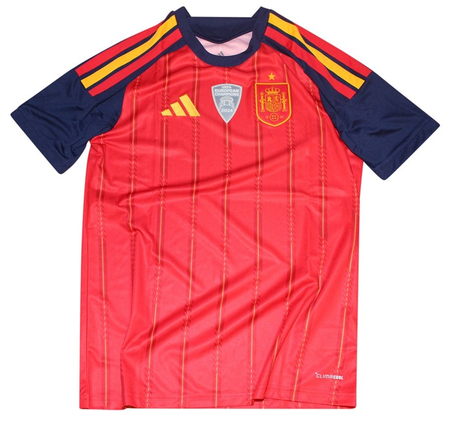
Elegant Pinstripes and Cultural Pride: The Spain 2026 World Cup Jersey
When you think of Spanish football, you think of La Roja—a sea of unrelenting red, dictated by flawless passing and majestic control. For the 2026 World Cup, Adidas has stripped away unnecessary noise to deliver a kit that treats the Spanish flag not just as an emblem, but as the very texture of the shirt. It is a design that bridges the gap between old-school aristocratic elegance and the electric energy of Spain’s new generation.
1. The Narrative: Classic Majesty Meets the New Era
Spain enters the 2026 World Cup cycle with a terrifyingly talented squad that blends veteran composure with fearless youth. This jersey reflects that exact energy. Instead of chaotic graphics or experimental patterns, Adidas leaned into a timeless, sharp aesthetic. It’s an understated statement of confidence—a shirt designed for a team that doesn’t need to shout to be feared.
2. The Design: The “Flag in Pinstripes”
The visual identity of the 2026 kit is built on a vibrant “Vivid Red” canvas, but the magic is in the details:
- The Golden Lines: Subtly cutting through the red base are thin, repeating yellow pinstripes. These elegant lines are a direct homage to the traditional composition of the Spanish flag and the royal heritage of the national crest.
- The Royal Accents: The collar and sleeve cuffs feature a rich blend of gold and burgundy trim, framing the bright red and giving the entire uniform a regal, prestigious finish.
3. The Cultural Stamp: The Power of “La Ñ”
The most inspired storytelling detail is hidden on the back of the neck. Etched into the fabric is the word “ESPAÑA.”
- The Symbolism: Rather than a generic font, the standout feature is the emphasis on the distinctive letter “Ñ”.
- It is a deliberate, proud celebration of the Spanish language and the country’s unique cultural footprint on the global stage. It reminds the players of the linguistic and historical identity they are defending every time they step onto North American soil.
4. The Players: Tailored for Magicians and Speed Demigods
A jersey this sharp needs to look good in motion, and Spain has the perfect players to bring it to life.
- The regal pinstripes feel perfectly aligned with the smooth, calculating genius of Rodri or Pedri, looking less like athletic gear and more like a tailored suit for midfield maestros.
- Meanwhile, the striking contrast of the gold trim against the vivid red acts as the perfect visual blur when wingers like Lamine Yamal and Nico Williams leave fullbacks in the dust.