Manchester City 2012-2013 Home Short Sleeve Shirt Review
by Julian Smith, Lisbon, Portugal.
It took 44 years and £481 million (at current exchange rates about €590 or $770 million), but Manchester City finally reclaimed the top spot in the Premier League last year. It’s easy to say you can’t claim that ALL that cash won them the title, but it’s hard to argue that at least £38 million (about €45 or $60 million) didn’t. This was the transfer fee paid for Sergio Agüero at the beginning of the season who scored a dramatic stoppage-time winner vs QPR on the last match day of last season, allowing The Citizens to surpass the Red Devils of Man United on points to win the Premier League title.
I’ve always been a fan of light blue as a background color for a shirt, so I have a particular affinity for Man City shirts, but this year’s shirt in particular has some interesting new design points too.
The Shirt
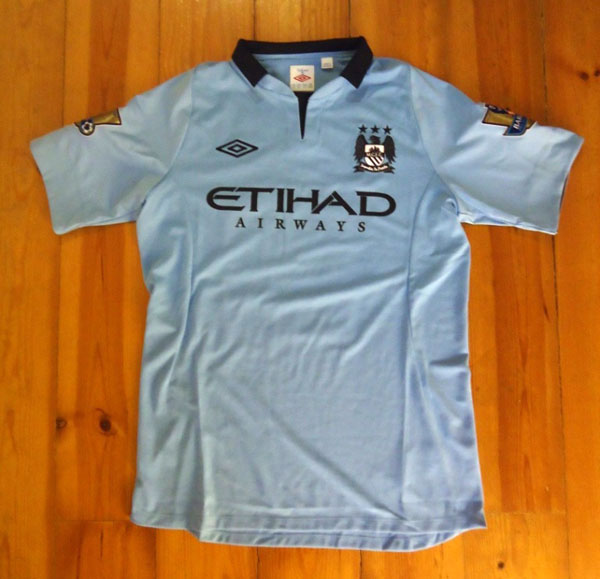
Manchester City’s 2012-13 home shirt features their distinctive sky blue color as a base, and they opted for black as the second color, which was used as the base back in the 1880’s when the club was known as St Marks (West Gorton). When I first saw the color combo, I was a little turned off, but it has definitely grown on me and the colors do seem to complement each other well and it all looks good when worn off the skin.
Since 2000, City have used three different suppliers in Le Coq Sportif, Reebok, and a brief stint back with Le Coq Sportif before turning to Umbro (through Nike) in 2009. Umbro probably make the best replica kits in the game as they normally manufacture a polyester/cotton combo (in this case 80%/20%) for lots of comfort and a great feel when worn.
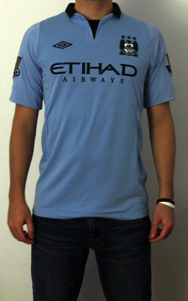
*Note: Shirt being worn is a medium, wearer is 6’1” and 160 pounds (1.85m, 72.5 kg)
While City’s first home shirt from the Umbro series was a bit bland, in that it was almost too simple, they have made steps over the years to add some unique details to their shirts.
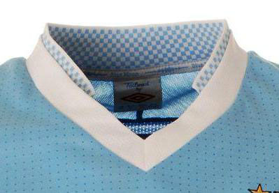
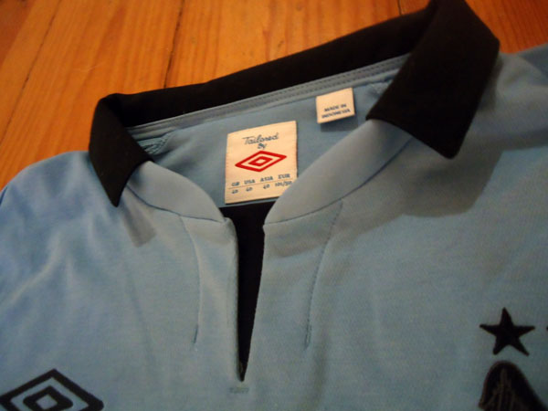
I absolutely loved the 2011-12 collar (see first picture above), thinking it would be hard to top. When I first saw the 2012-13 collar I was a bit concerned as smaller, protruding collars can sometimes be flimsy and flop around when worn. This is not the case with this year’s dark collar (see next picture above), which stays rigid almost naturally.
Details
Everyone knows the saying “nothing in life is free”, so with the big money for transfers comes the Etihad Airways sponsorship. The look of the sponsor is nothing special, same with the feel of the plastic material…
The shirt overall lacks extras, but one thing to highlight is the neckline cut-out (see collar picture). In terms of ventilation or feel the feature is pretty useless, but together with the collar it all looks pretty slick.
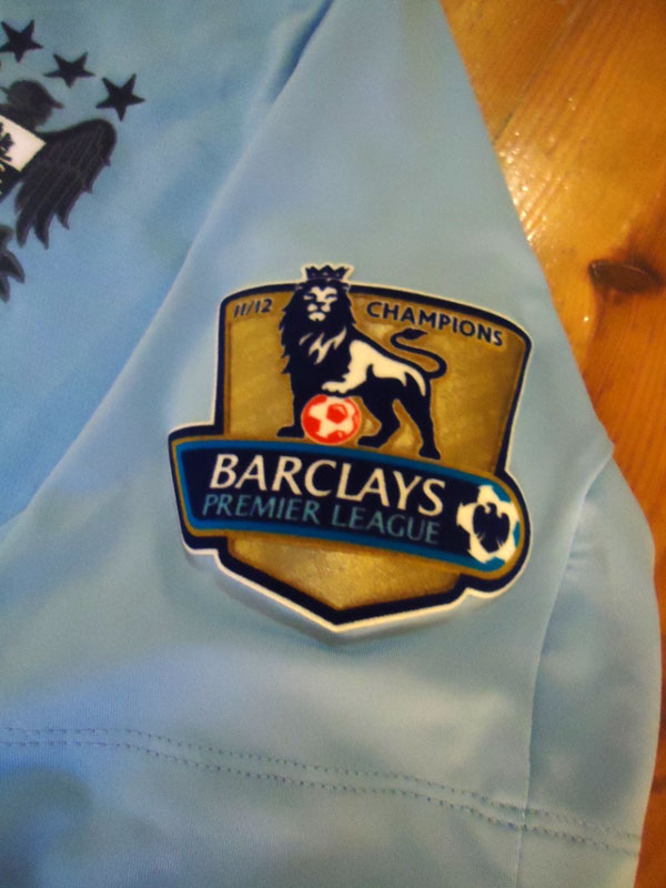
As champions, City this year earned the gold premier patches for their shirt. Not a big fan of the gold matched with the dark tones of the shirt, but the patches are all about pride so you it’s a sacrifice I’m sure they, and their fans, are happy to swallow.
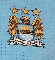
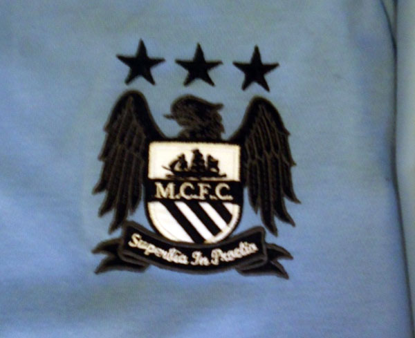
A (disappointing) change to the shirt is the badge. While the black looks good to match the other features, the colored crest looks a lot better with the sky blue. See above for the badge from last year first, followed by this year’s “black-out” badge. Both badges are stitched into the shirt, not plastic.
Printing
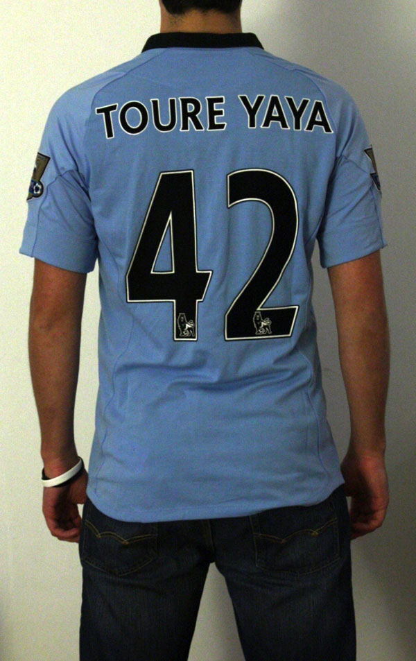
In some of my other reviews I’ve noticed that I tend to be pretty critical of printing on shirts. Almost all shirts in my collection have printing, even if I don’t like the font so much, just to have my team hero for all to see. When it comes to the English Premier League, though, I’m very happy with the look of the characters.
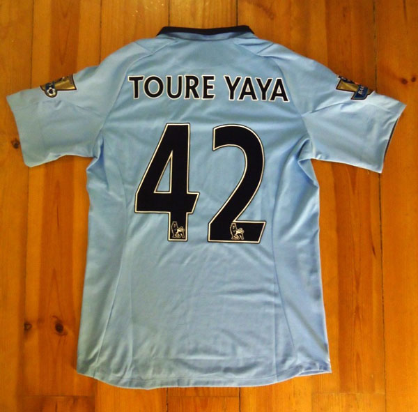
I was a bit wary that the black font would be a bit overwhelming with the sky blue color of the shirt since the numbers are so large, but, as mentioned before, put all together with all the other black details it looks quite nice.
Conclusion
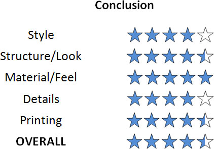
This is definitely one of my favorite shirts from this season. It isn’t one of the best looking, but you can’t go wrong with structure and feel from Umbro. Perhaps they should have decided to go with the “black-out” look to another shirt, but this one still looks ok from a design standpoint.
As always, the official kit and printing are available to purchase from MMSports.
