The White Sails: Portugal’s 2026 World Cup Away Kit
If the 2026 Home Jersey is the “Armor” of the Navigator, the 2026 Away Jersey is the “Sail.” Traditionally, Portugal’s away kits have been seen as a secondary thought, but for the 2026 World Cup in North America, the white-and-green palette has been elevated to represent the very vessels that once carried the Portuguese flag to the “New World.”
This isn’t just a change of colors for when the red kit clashes; it is a tactical “clean slate” for a generation that intends to conquer the Western Hemisphere.
The “Caravel” Aesthetic: Why White?
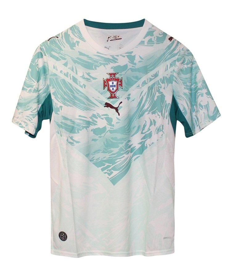
The choice of a crisp white base is a direct historical bridge to the 15th century. It represents the canvas sails of the Portuguese caravels. In the context of the 2026 World Cup—hosted across the USA, Canada, and Mexico—the color serves as a symbolic return to the lands Portuguese explorers first mapped.
The Navigator’s Detail: Like the home kit, the away jersey features the Rosa dos Ventos (Navigation Star) on the back of the neck, ensuring that even when playing “away,” the team’s direction remains fixed on the final in New York/New Jersey.
The Verde Esperança (Green Hope): The accents on the collar and sleeves utilize a deep forest green. In Portuguese heraldry, green represents esperança (hope). For the 2026 squad, this “hope” is no longer a wish—it is a mission statement following their 2025 Nations League dominance.
A “Clean Sheet” Mentality
There is a psychological “twist” to the white kit. Historically, Portugal has often struggled in major World Cup away fixtures when forced out of their traditional red. However, the 2026 version is built on the “Clean Sheet” philosophy.
Following the defensive masterclasses seen in the 2025 Nations League, this jersey represents a team that is comfortable being the “villain” in a stadium full of opposing fans. The white kit is no longer a symbol of neutrality; it is the uniform of a clinical, tactical machine that has outgrown the “tragic hero” narrative of the past.
The 1966 Parallel: The Missing Link
It is a little-known fact that during the legendary 1966 World Cup run, Portugal’s most iconic moments happened in red. But as we approach the 60th anniversary of that tournament, the 2026 Away kit seeks to create its own “Gold Standard.”
The design strips away the “distraction” patterns often seen in previous away shirts (like the 2022 circles or the 2024 patterns) in favor of a stark, high-contrast look. It is a “no-nonsense” kit for a “no-nonsense” era. By using a minimalist white-and-green template, Puma is betting on the players—not the fabric—to provide the color.