Netherlands is Orange. That is one of the few universal truths in international football.
The Netherlands (2026) — The Architecture of Total Football
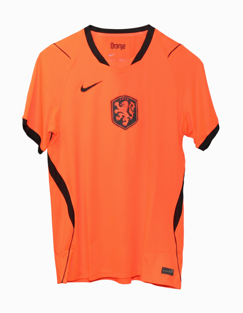
The 2026 home kit for the Netherlands approaches the tournament through the lens of structural innovation and historical symmetry. Rather than looking purely to nostalgia, this home shirt reimagines the iconic Oranje identity by blending a hyper-vibrant orange base with stark, minimalist black details on the collar, cuffs, and side panels. It is a design ethos heavily rooted in the cultural principles of functional art and architectural precision, mirroring a nation that has always treated football as an intellectual chess match rather than a simple game of chance.
At the heart of the shirt lies its most discussed element: a completely centralized KNVB lion crest. By moving the national emblem to the exact middle of the chest, the design structurally evokes the era of “Total Football”—the fluid, revolutionary system pioneered by Johan Cruyff and the legendary squads of the 1970s. This layout deliberately places the collective identity ahead of the individual, serving as a fitting tribute for a modern roster under Ronald Koeman that relies heavily on the balanced midfield mastery of Frenkie de Jong and the rising prominence of Ryan Gravenberch. For the Netherlands, a football shirt is never just apparel; it is a manifestation of national ideology. As they cross the Atlantic, this central crest acts as an anchor, reminding the players that avenging the historical heartbreaks of 1974, 1978, and 2010 requires a perfect fusion of individual genius and structural discipline.