Italy is one of those countries which typically runs the same color scheme always, on home and away jersey.
Blue for the home shirt. White for the away kit. The 2026 no-World Cup collection is no exception.
Intro:
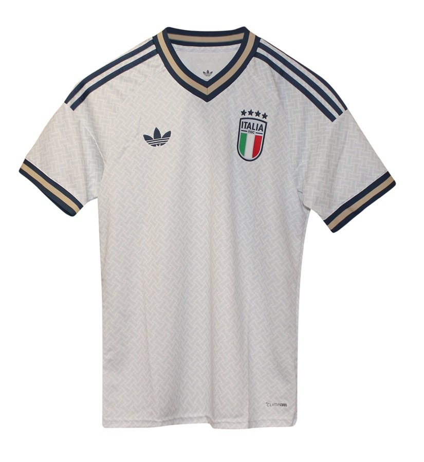
The away kit is indeed very beautiful and very stylish. In a away it embodies all the best Italy has to offer with regard to design, fashion and style. A dark white base with a tasteful pattern engraved. Gold and navy contrasts. Trefoil logo right, and Italy FIGC crest right. All in all a small masterpiece since white is a difficult color to work with. Often it gets either very boring or the contrasts take over completely leaving the white base secondary at most. This one kit finds the exact right balance. So kudos to adidas for that. But Italy itself will have to carry it with the shame of missing out for the World Cup third time in a row. Not good for a 4 times World Champion country.
The Suit of Sorrows: Italy’s 2026 Away “Gala” Kit
There is something profoundly Italian about failing, but doing it while looking better than everyone else. This away jersey isn’t just a football shirt; it’s a high-fashion consolation prize.
1. The “Aeroblue” Mirage
The base color is “Aeroblue”—a pale, ethereal, ghostly blue that sits somewhere between a summer sky and a cold sweat. It’s a beautiful, light hue designed to reflect the North American sun. The irony, of course, is that the only “Aeroblue” the Italian players will be seeing this June is the color of the swimming pool at their holiday resorts while Bosnia and Norway are duking it out in New Jersey.
2. Bespoke Bitterness: The Tailored Texture
The standout feature is the jacquard woven pattern. Adidas designers reportedly took inspiration from the legendary “celebration suits” worn by past winning squads. The fabric features a subtle, interlocking texture that mimics the weave of a fine Italian suit. It’s elegant, it’s sophisticated, and it’s entirely wasted. It is a kit designed for a trophy presentation that isn’t happening.
3. The Trefoil: A “Lifestyle” Surrender
For the first time in decades, the Adidas Trefoil replaces the performance logo. It’s a move that feels honest, if a bit depressing. By using the “Originals” logo, Adidas is subtly admitting that this isn’t a piece of elite sporting equipment for the world stage—it’s a lifestyle garment. It’s a shirt for fans to wear to a bar while they pretend they don’t care that the World Cup is on. It’s fashion first because, for Italy, the football has become secondary.
4. The Monogram of Exile
Flip to the back of the collar, and you’ll find a delicate “Italia” monogram, styled like the personalized embroidery found on a bespoke shirt. It’s a touch of class that screams “Old Money,” yet the team currently feels like it’s bankrupt. Combined with the navy blue and gold trim on the V-neck, it creates a look of absolute authority—the kind of authority you usually need to actually be in the tournament to command.
5. The Verdict: The Most Beautiful Tragedy in Sports
If you see someone wearing this in June 2026, give them a hug. They are wearing a three-star Michelin meal that was served to a person with no sense of taste. It is objectively one of the most stunning designs in the Adidas 2026 portfolio, proving once and for all that in Italian football, the “Aesthetics” department is the only one still doing its job.