Italy 2013 Home Short Sleeve Shirt Review
by Julian Smith , NYC
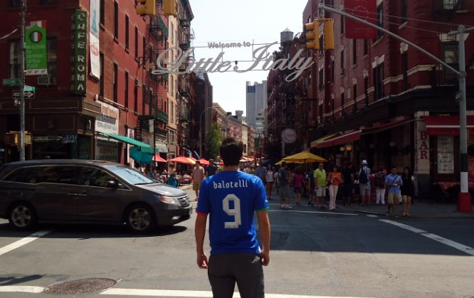
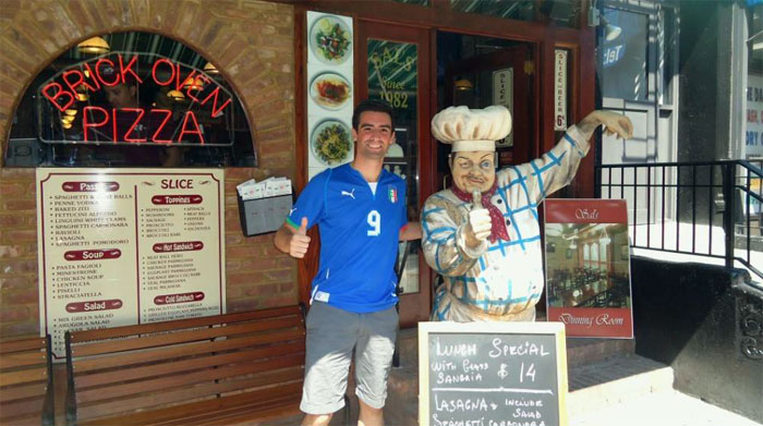
*Author’s note: I just moved to New York City and decided to incorporate some pictures of Manhattan into my review, especially of Little Italy! Hope you like them!

Gli Azzuri have slowly, and quietly, been rebuilding over the past few years to return to their rightful status as a European powerhouse. After their success at the 2006 World Cup, Italians had to suffer through a few years of disappointment as aging stars succumbed to their inevitable abatement of talent over time. Italy only managed a quarter finals appearance at the 2008 European Championships followed by a disastrous group stage exit at the 2010 World Cup. It seems the trip to South Africa was a wake-up call though, and a crop of exciting, young footballers (Mario Balotelli, Lorenzo Insigne, Marco Verratti) have emerged to complement the ever present contingent of classy veterans (Andrea Pirlo, Gianluigi Buffon, Daniele De Rossi). The team is really coming together, as shown by their dominant semi final performance over Germany at Euro 2012 (but in spite of a bitter loss to Spain in the final) and a respectable third place finish at the 2013 Confederations Cup (after losing to Spain again this time on penalties in the semi finals). With a few more years, this author believes they will soon legitimately have the opportunity to recreate Fabio Cannavaro’s iconic trophy lifting photo.
Italians, and their shirts, have always been a bit flashy… who could forget their gold print at the 2006 World Cup?! The new home kit is a wonderful combination of style, sensible design, and intricacy that any non-French fan will appreciate (and that’s only because of the rivalry!).
The Shirt

Italy’s 2013 home shirt uses a familiar blue base and, as is common in Puma shirts, is made from a sheer material which is great for summer attire and has breathable side vents. These features, along with the typical t-shirt design (in that there are 4 openings for arms, neck, and lower body), are where all common design traits end.

*Note: Shirt being worn is a medium, wearer is 6’1” and 160 pounds (1.85m, 72.5 kg)
Because of the shirt’s structure, the fit can look different depending on the wearer. The light blue, protruding seams coming from the shoulder through the armpit create a nice separation aesthetically, but can cause the shirt to lie strangely on the wearer’s body depending on body type. As shown in the picture above, in a natural position a skinny wearer of the shirt will have an inverted “v” coming up the stomach/chest area. A more muscular, or larger person, probably would fit in it better.
Details

There are a few distinctive attributes to this shirt that make it very tasteful. The first, and most notable (especially when seen worn), is the collar. In typical Italian fashion style, the collar has been lowered to show more of the wearer’s chest which creates an athletic look. The lowered “v” of the collar is patched under the shirt’s surface with white, creating a look that is both stylish and sporty.
The blue base and white accent color scheme works very well, with major accents placed on the collar and lower, front sides. A striking decision was made to move away from the routine symmetrical format, but the red and green accents on the sleeve openings add a nice, out of the ordinary pop to the shirt.
Another flashy design point is the shadowed, thin lines coming in from the shoulder to the middle of the chest. While it’s easy to say this is over the top and ultimately unnecessary, try to imagine the shirt without the lines and I think you will agree that it takes a lot away from it, rather than adding much.
The FIGC crest is also of a very interesting design as it looks more to have been printed on piece-by-piece, rather than the more common patched on emblem. It looks great on the shirt, but it’s probably best to wear with caution as I could see individual pieces coming off over time. The Puma logos are sown into the shirt.
Printing

As I have said in previous reviews, I am usually not a fan of Puma’s “cro-magnon” printing font. The accents added to this shirt’s print, though, gives flair to complement the rest of the shirt. The overall bold outside border is a nice finishing touch. The numbers include shadows which add depth, and the finishing makes them look almost as if they are three dimensional. This is a huge upgrade from the plain monochrome Puma font used in recent years.

Conclusion


A very unique design that looks great on fans and footballers alike, this really is a must have summer football shirt. If not for the structure that does not suit all wearers, this would be an almost perfect shirt for warm weather. I hope to see Puma continuing to improve minor details to really step up to the level of Nike and Adidas.
As always, the official kit and printing are available to purchase from MMSports.

