by Julian Smith, NYC
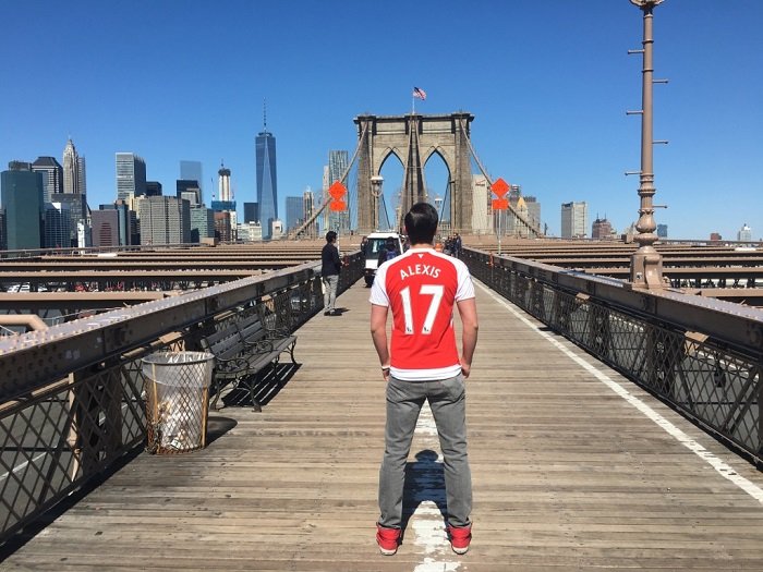
As the season comes to a close, it has been another of those all too familiar frustrating seasons for the Gunners… Individuals, like Mesut Özil and Laurent Koscielny, shined bright at various points throughout, but as a collective Arsenal still have not found the secret ingredient to lift the Premier League trophy. It seems the club are in a great position to compete with the mega millions invested by the likes of the Manchester clubs and Chelsea, but the emergence of this year’s title challengers Leicester City and Tottenham could be problematic for their desire to clinch the top spot in the upcoming seasons.
Luckily, they were able to look as stylish as ever in their home kit this year (… erm… let’s not talk about the away kit) as Arsenal geared up in the second iteration of Puma’s jersey design. The shirt features many of Puma’s distinctive features, but also includes some sleek and fun design points that make this jersey one of Arsenal and Puma’s best in recent memory.

The Shirt
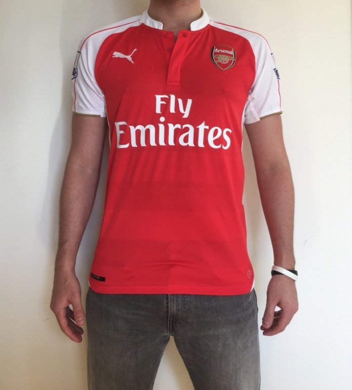
Arsenal’s 2015-16 home shirt features a recognizable true red base with accents in white and gold trim. The shirt incorporates Puma’s signature Dry Cell material, which is light and comfortable without feeling too flimsy. The shirt is extremely breathable, which I will highlight later in this review, but has enough weight so it doesn’t feel cheap. The shirt wears slim, especially as it tapers slightly towards the bottom, although it is not too tight.
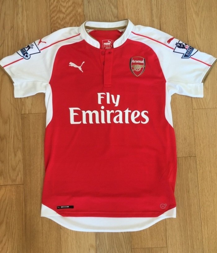
The red base is contoured around the white accents on the shoulders and underarms to show off a trendy new style. It looks great alone and especially on when worn.
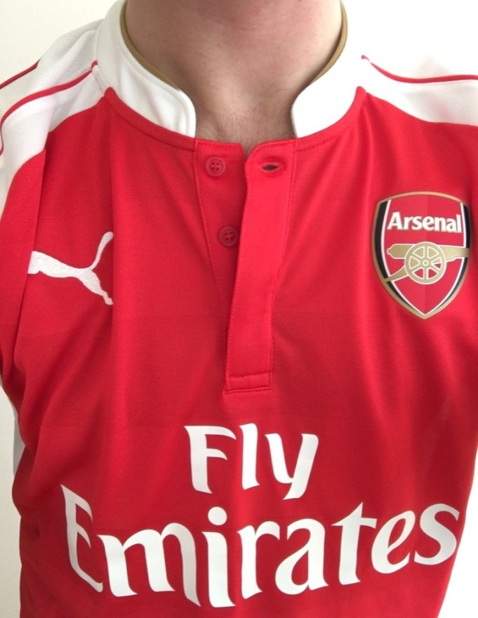
One of my favorite design points of this shirt is the Mandarin style collar. It is rarely seen on football shirts, and looks especially good with the rest of this jersey. The gold trim is an especially classy touch.
Unfortunately, that positive point is detracted by the three buttons on the collar. First, if you’re going to have buttons only have two: not one or three. While they don’t necessarily feel flimsy, I’m sure over time they will come off. Puma even provides one extra on the tag for when this inevitably happens.

The Arsenal badge is ironed on. I usually prefer when the badge is stitched, but this badge has a dynamic 3D design that looks great and feels of good quality.

This year’s jersey features horizontal strips of more breathable fabric along the front which is only truly noticeable up close. It may throw you off if you are looking within a few meters of the shirt, but I did not notice this until I got up close.

While I can’t say I necessarily feel the difference with these strips, the shirt is extremely breathable, as seen from the above shot of the back material.

Another of the few negatives to highlight is the back flap (for lack of a better word). For whatever reason, the designers added this feature which makes the back of the shirt longer than the front.
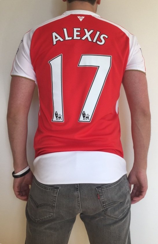
It always rides up and bunches, which makes me think it shouldn’t have been added at all. Perhaps it was done on the player version to blend better with the shorts, but they should have removed this on the fan/replica versions.
The Print
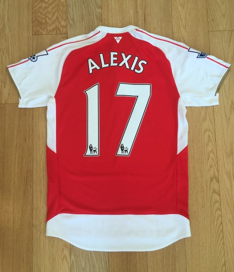
The English Premier League has featured the same characters on printing for over 10 years, but the new PS-PRO material is much lighter than the previous felt-like editions.

The font is simple, the colors are bright, and with a great league logo, these are probably my favorite prints of all!

Another favorite to add to my collection, this shirt is only a few strange decisions (back flap, three buttons) away from being perfect in this author’s estimation. Hopefully the shirt design and club results go hand in hand, and the club can reach top in both respects next year!
As always, the official kit and printing are available to purchase from iDfootballdesk.
